Data Visualization
Homework 3
Learning Objectives
Visualizing data in
ggplotFunctions:
ggplot,Applications: College data
Agenda
Visualization is one of R’s most impressive features, and arguably where it surpasses other competing programs like Python. Visualization can either be done in “base” R, or via a powerful set of functions included in the ggplot package. In this class, we will be working exclusively in ggplot, which is included in the tidyverse package.
Let’s start by loading our college data again.
Load relevant libraries
library(tidyverse)Load The Data
Once tidyverse is loaded, you can download the data directly from GitHub using the read_rds() function. You should then open it in R by assigning it to an object with the <- command.
df<-read_rds("https://github.com/rweldzius/PSC4175/raw/main/static/data/sc_debt.Rds")
names(df)
## [1] "unitid" "instnm" "stabbr" "grad_debt_mdn"
## [5] "control" "region" "preddeg" "openadmp"
## [9] "adm_rate" "ccbasic" "sat_avg" "md_earn_wne_p6"
## [13] "ugds" "costt4_a" "selective" "research_u"ggplot
ggplot works in layers, where the most simple layer is contained in the ggplot() function itself. Here, you set the x and y axes with a function called aes() (for the plot “aesthetics”). The primary inputs to aes() are x and y, although you can also set things like color and fill here.
Let’s create the first layer of our plot by using the %>% function to link our data with the ggplot() function.
df %>%
  ggplot(aes(x = adm_rate,y = sat_avg))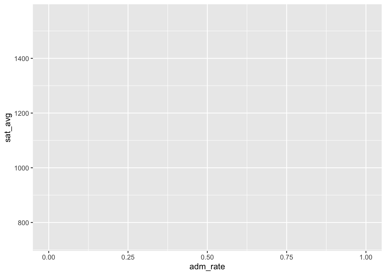
This gives us a rather ugly looking graph box (see the bottom right quadrant of RStudio), where we see the admissions rate on the x-axis (the horizontal axis) and the SAT scores on the y-axis (the vertical axis). However, there are no visuals like lines or bars or points to help us actually SEE the data. We know that ggplot has them on the axes we specified, but we haven’t drawn anything yet.
The next step is to add a “layer” to this plot that contains the visuals we want. To add a layer, we use the + sign to link our blank canvas to the function to draw the graph. In this situation, we are going to create a scatterplot using the function named geom_point(). (There are many other functions that are included with ggplot which will draw different plots…geom_line() and geom_bar() for example.)
df %>%
  ggplot(aes(x = adm_rate,y = sat_avg)) +
  geom_point()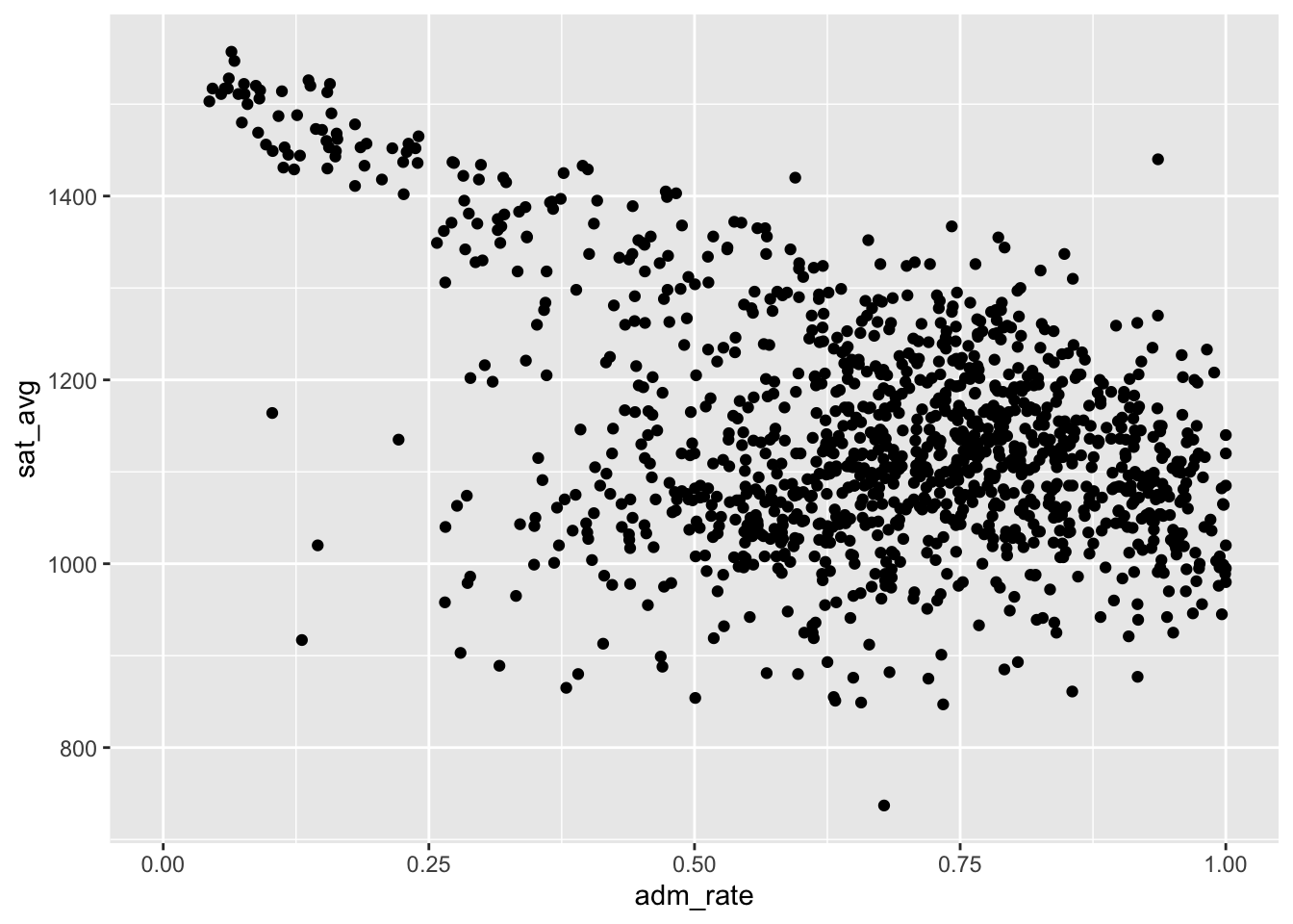
Tweaking Visuals
We have a visualization of our data! It suggests that there is a negative relationship between the admissions rate and SAT scores. When the admissions rate is very low (i.e., when schools are very selective), the average SAT scores of their students is above 1500 (top left part of the graph). When the admissions rate is very high, the average SAT scores is around 1000 (bottom right of the graph). Why might this be?
We can easily see this pattern just by looking at the data. However, we can make it even more clear by overlaying a “line of best fit” using a different function called geom_smooth(). This is going to be our second layer, meaning we need another + sign to link the function.
df %>%
  ggplot(aes(x = adm_rate,y = sat_avg)) +
  geom_point() +
  geom_smooth()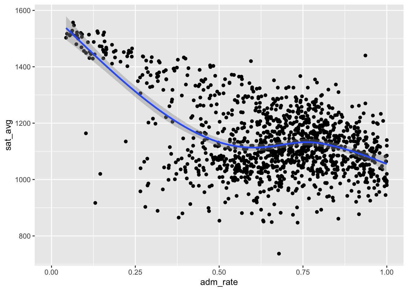
The default behavior of geom_smooth() is to draw a slightly curvy line that bends. This is potentially useful, since it reveals that the negative relationship between the admissions rate and the SAT scores is stronger among more selective schools (i.e., those with an admissions rate less than 0.50 or 50%), but almost flat among less selective schools.
However, if all we want is the overall relationship drawn with a straight line, we need to tell geom_smooth() to draw a straight line with the input method = "lm". (“lm” stands for “linear model”, a topic we will come back to later in the semester.)
df %>%
  ggplot(aes(x = adm_rate,y = sat_avg)) +
  geom_point() +
  geom_smooth(method = 'lm')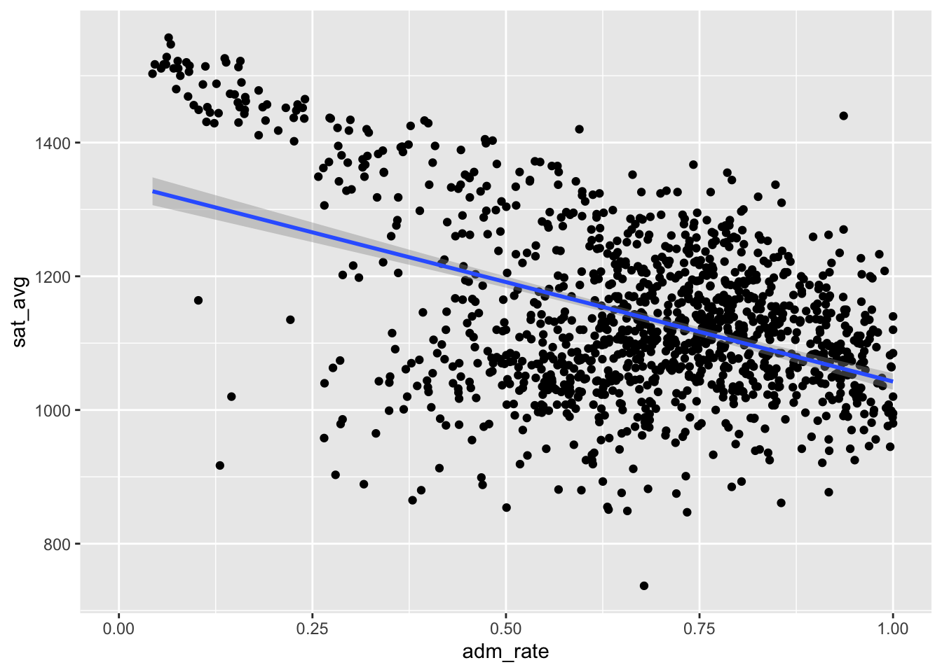
Colors
We can continue to tweak this plot by changing the colors of the points. For example, we could color EVERY point red as follows
df %>%
  ggplot(aes(x = adm_rate,y = sat_avg)) +
  geom_point(color = 'red')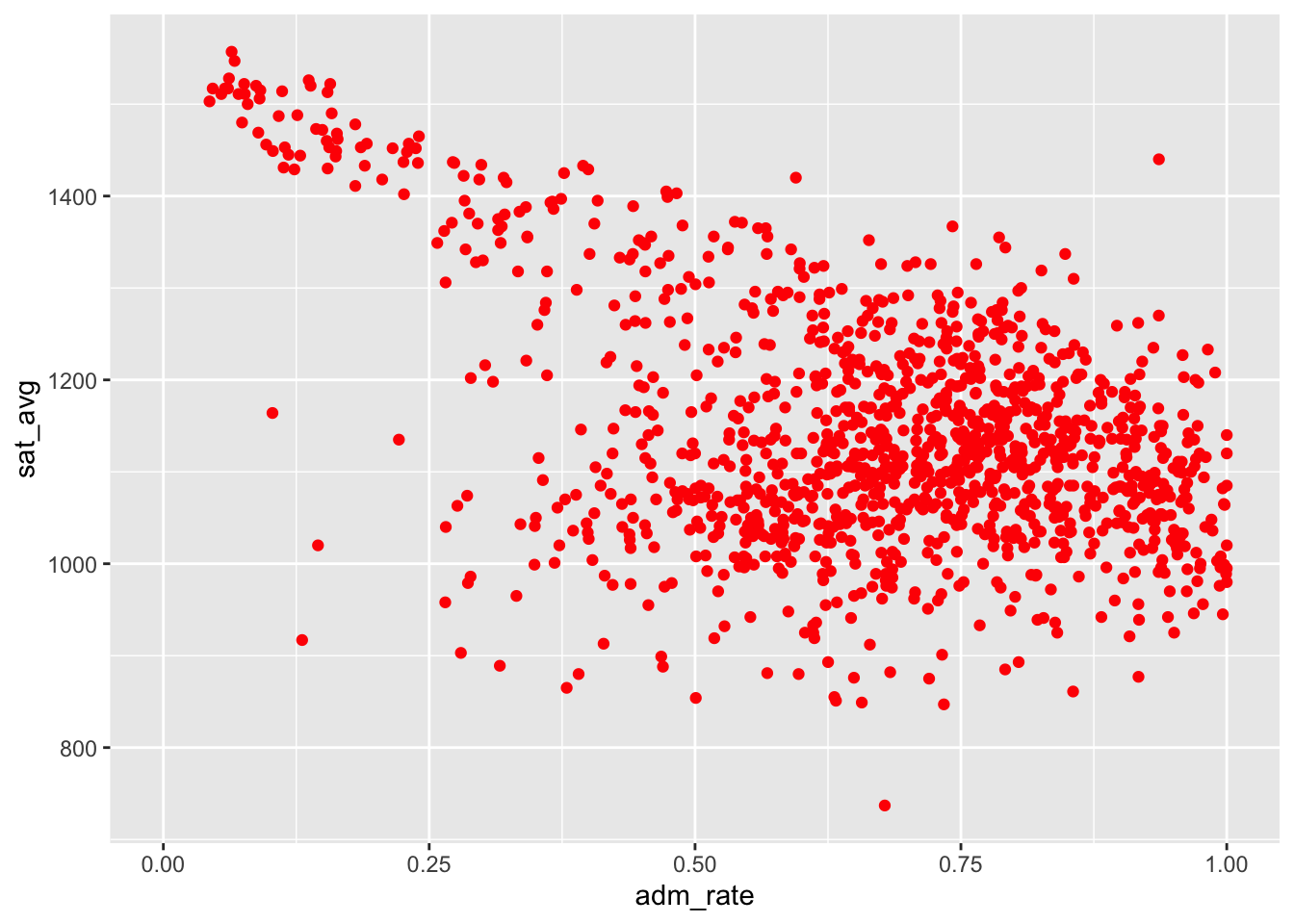
However, we could instead color points based on their value. To do so, we want to move the color input inside the aes() function, and set it equal to the variable we want to visualize with color.
df %>%
  ggplot(aes(x = adm_rate,y = sat_avg,
             color = region)) +
  geom_point()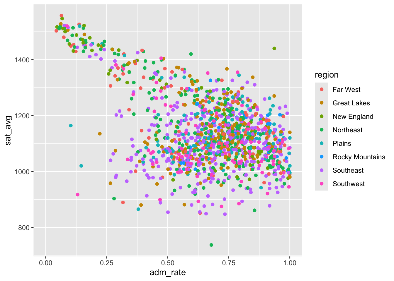
We now have a legend added to the plot that tells us what each color refers to. In this example, we set the color equal to a categorical variable. We could instead set it equal to a continuous variable, which would give us a gradient.
df %>%
  ggplot(aes(x = adm_rate,y = sat_avg,
             color = md_earn_wne_p6)) +
  geom_point()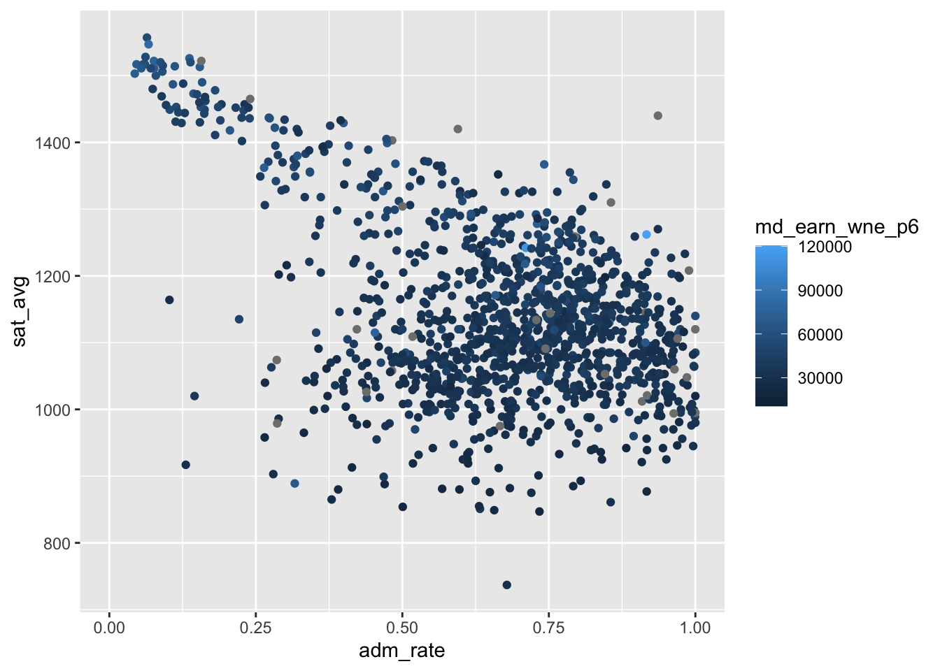
Here we see two patterns. First, we continue to see the negative relationship between the admissions rate and the SAT scores. Second, we can kinda see a relationship between future wages of graduates and their SAT scores.
If we don’t like the default choice of dark to light blue, we can modify this with scale_color_gradient(). As always, add another + to add the layer to the plot!
df %>%
  ggplot(aes(x = adm_rate,y = sat_avg,
             color = md_earn_wne_p6)) +
  geom_point() +
  scale_color_gradient(low = 'grey90',high = 'darkred')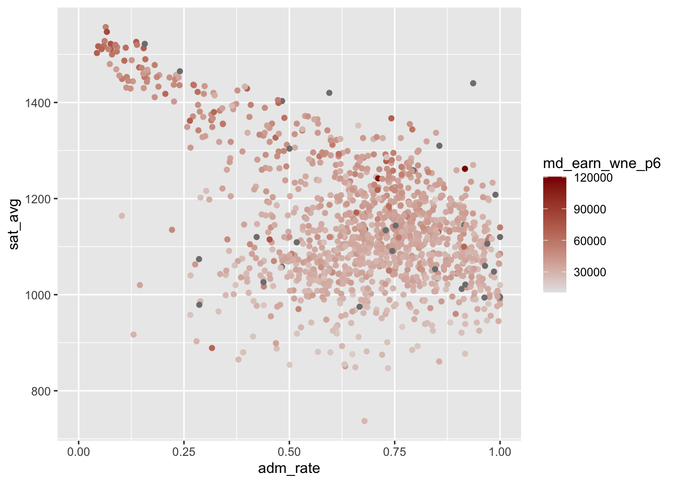
Note that some of the points are dark gray. These are schools that don’t report the median earnings of their recent graduates. These missing data default to a dark gray color. You can find more colors in the R color palette here: https://r-graph-gallery.com/color-palette-finder.
Quick Exercise Re-do this plot but put md_earn_wne_p6 on the y-axis, and sat_avg on the x-axis. Is there a relationship between SAT scores and earnings? Why might this be the case?
# INSERT CODE HEREWrite your answer to the questions here.
Other Aesthetics
We can also change the size of the points with the size input. As with color, this can either be set uniformly for all points, or we can make the size a function of another variable.
df %>%
  ggplot(aes(x = adm_rate,y = sat_avg)) +
  geom_point(size = 3) +
  labs(title = 'Uniform Size Setting for all points')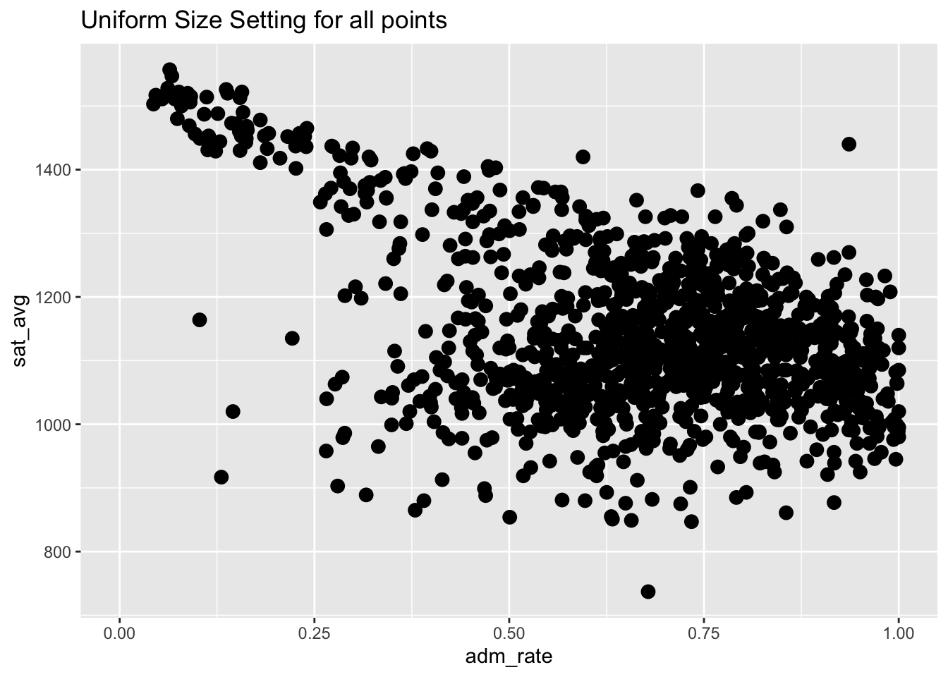
df %>%
  ggplot(aes(x = adm_rate,y = sat_avg,
             size = md_earn_wne_p6)) +
  geom_point() +
  labs(title = 'Sized by the future earnings')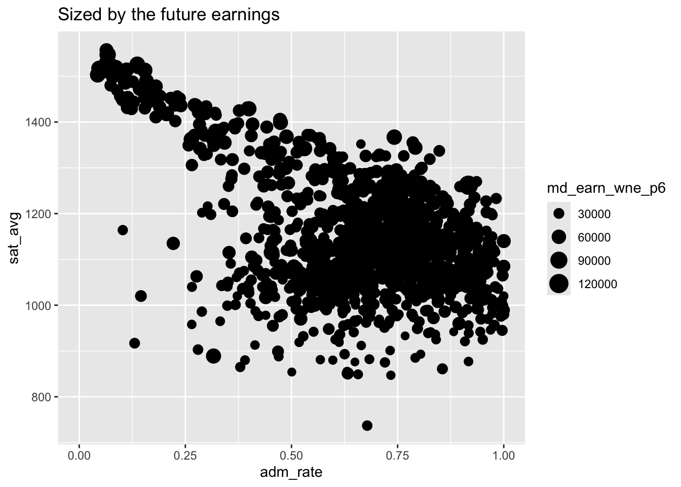
Transparency
With so many points overlapping, especially with larger points, it becomes harder for the reader to see details. We can therefore adjust the transparency of these points with the alpha parameter, which can be a value between 0 and 1. Values closer to zero make the points more transparent, while values closer to 1 make them more opaque.
df %>%
  ggplot(aes(x = adm_rate,y = sat_avg,
             size = md_earn_wne_p6)) +
  geom_point(alpha = .3) +
  labs(title = 'Sized by the future earnings')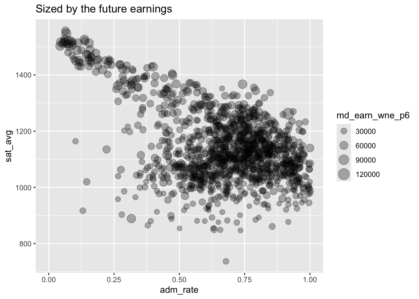
Other Types of Plots
This topic is very deep and you can spend years becoming an R expert and still find new ways of visualizing things. I encourage you to keep this link bookmarked: http://r-statistics.co/Complete-Ggplot2-Tutorial-Part1-With-R-Code.html.
For now though, a few other types of plots:
Histograms & Densities
For visualization of a single measure (what we often call a univariate plot), a histogram is often useful. Here, we only need to set the x-axis variable. The geom_histogram() function will calculate the y-axis values for us, which is the number of schools falling into each bin. If we add all the bins together, we get the total number of schools in the data.
df %>%
  ggplot(aes(md_earn_wne_p6)) +
  geom_histogram()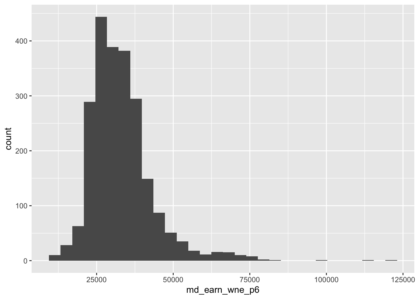
We can also get the same result with a density plot, which replaces the histogram with a line. The y-axis becomes the fraction of schools at each point on the x-axis, and adds up to 1.
df %>%
  ggplot(aes(x = md_earn_wne_p6)) +
  geom_density()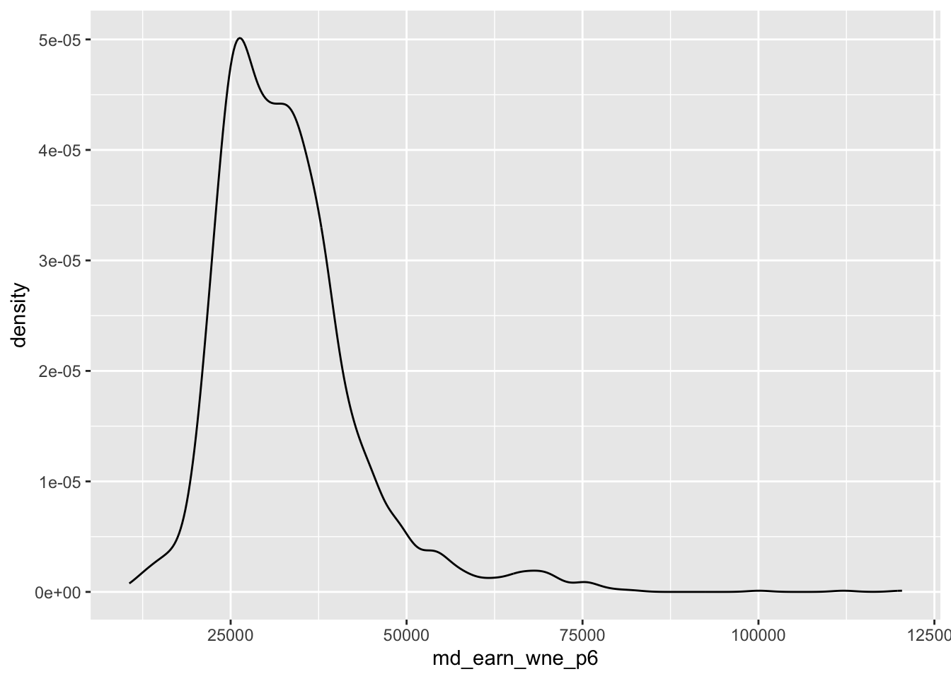
Barplots
Barplots are another common type of data visualization. These are more appropriate for categorical data, or for types of continuous data where there are only a handful of distinct values.
df %>%
  ggplot(aes(x = region)) +
  geom_bar()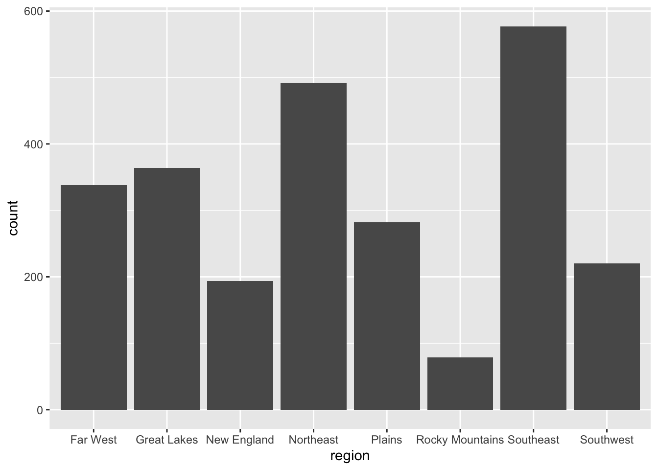
Your final research project
It’s time to start thinking about your final project for this course! The project will be worth 20 points (write-up 15 points, presentation and comments 5 points), which means 20% of your final grade. You will need to come up with an interesting research question, find a dataset that will help you answer that question, and then åpply the tools from this course to that data. Students may work individually, or can work in groups of up to 3 students. I will include short assignments along the way so that you are incrementally working on and completing your project. My goal is for you all to get the full 20 points on this project!
Your first Research Exercise will be to provide me with two ideas for research questions. After each, please provide an explanation as to why you are interested in this topic and/or why you find it interesting (the “so what” question).
Research Question 1
Fill in question here.
Fill in explanation here.
Research Question 2
Fill in question here.
Fill in explanation here.