College Admissions, Part 2
Homework 13
College Admissions: From the College’s View [Recap]
All of you have quite recently gone through the stressful process of figuring out which college to attend. You most likely selected colleges you thought might be a good fit, sent off applications, heard back from them, and then weighed your options. Those around you probably emphasized what an important decision this is for you and for your future.
Colleges see this process from an entirely different point of view. A college needs students to enroll first of all in order to collect enough tuition revenues in order to keep the lights on and the faculty paid. Almost all private colleges receive most of their revenues from tuition, and public colleges receive about equal amounts of funding from tuition and state funds, with state funds based on how many students they enroll. Second, colleges want to enroll certain types of students– colleges based their reputation based on which students enroll, with greater prestige associated with enrolling students with better demonstrated academic qualifications. The job of enrolling a class that provides enough revenue AND has certain characteristics falls to the Enrollment Management office on a campus. This office typically includes the admissions office as well as the financial aid office.
The College Admissions “Funnel”
The admissions funnel is a well-established metaphor for understanding the enrollment process from the college’s perspective. It begins with colleges identifying prospective students: those who might be interested in enrolling. This proceeds to “interested” students, who engage with the college via registering on the college website, sending test scores, visiting campus, or requesting other information. Some portion of these interested students will then apply. Applicants are then considered, and admissions decisions are made. From this group of admitted students a certain proportion will actually enroll. Here’s live data from UC Santa Cruz (go Banana Slugs!) on their enrollment funnel.
Each stage in this process involves modeling and prediction: how can we predict which prospective students will end up being interested students? How many interested students will turn into applicants? And, most importantly, how many admitted students will actually show up in the fall?
Colleges aren’t powerless in this process. Instead, they execute a careful strategy to intervene at each stage to get both the number and type of students they want to convert to the next stage. These are the core functions of enrollment management. Why did you receive so many emails, brochures and maybe even text messages? Some model somewhere said that the intervention could convert you from a prospect to an interest, or from an interest to an applicant.
We’re going to focus on the very last step: from admitted students to what’s called a yield: a student who actually shows up and sits down for classes in the fall.
The stakes are large: if too few students show up, then the institutions will not have enough revenues to operate. If too many show up the institution will not have capacity for all of them. On top of this, enrollment managers are also tasked with the combined goals of increasing academic prestige (usually through test scores and GPA) and increasing the socioeconomic diversity of the entering class. As we’ll see, these are not easy tasks.
The Data
We’re going to be using a dataset that was constructed to resemble a typical admissions dataset. To be clear: this is not real data, but instead is based on the relationships we see in actual datasets. Using real data in this case would be a violation of privacy.
library(tidyverse)
library(tidymodels)
library(scales)ad<-read_rds("https://github.com/rweldzius/PSC4175/raw/main/static/data/admit_data.rds")%>%ungroup()Codebook for admit_data.rds:
| Variable Name | Description |
| ID | Student id |
| income | Family income (AGI) |
| sat | SAT/ACT score (ACT scores converted to SAT scale) |
| gpa | HS GPA, four point scale |
| visit | Did student visit campus? |
| legacy | Did student parent go to this college? |
| registered | Did student register on the website? |
| sent_scores | Did student send scores prior to applying? |
| distance | Distance from student home address to campus |
| tuition | Stated tuition: $45,000 |
| need_aid | Need-based aid offered |
| merit_aid | Merit-based aid offered |
| net_price | Net Price: Tuition less aid received |
| yield | Student enrolled in classes in fall after admission |
Logistic Regression
So far, we’ve been using tools we know for classification. While we can use conditional means or linear regression for classification, it’s better to use a tool that was created specifically for binary outcomes.
Logistic regression is set up to handle binary outcomes as the dependent variable. The downside to logistic regression is that it is modeling the log odds of the outcome, which means all of the coefficients are expressed as log odds, which (almost) no one understands intuitively.
Let’s take a look at a simple plot of our dependent variable as a function of
one independent variable: SAT scores. I’m using geom_jitter to allow the points
to “bounce” around a bit on the y axis so we can actually see them, but it’s
important to note that they can only be 0s or 1s.
Yield as a Function of SAT Scores
ad%>%
  ggplot(aes(x=sat,y=yield))+
  geom_jitter(width=.01,height=.05,alpha=.25,color="blue")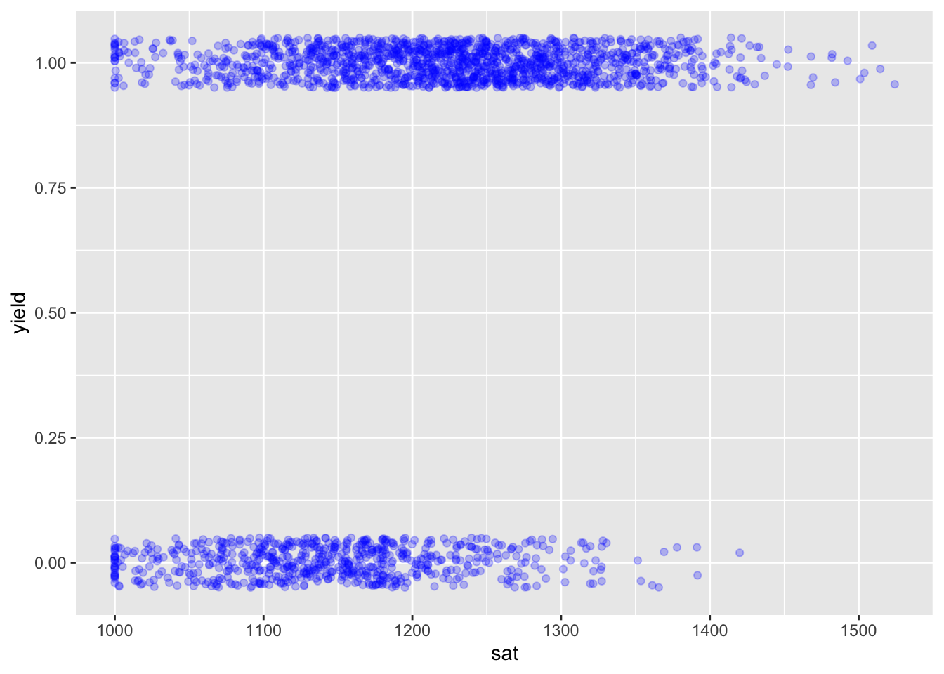
We can see there are more higher SAT students than lower SAT students that ended up enrolling. A linear model in this case would look like this:
Predicted “Probabilities” from a Linear Model
ad%>%
  ggplot(aes(x=sat,y=yield))+
  geom_jitter(width=.01,height=.05,alpha=.25,color="blue")+
  geom_smooth(method="lm",se = FALSE,color="black")
## `geom_smooth()` using formula = 'y ~ x'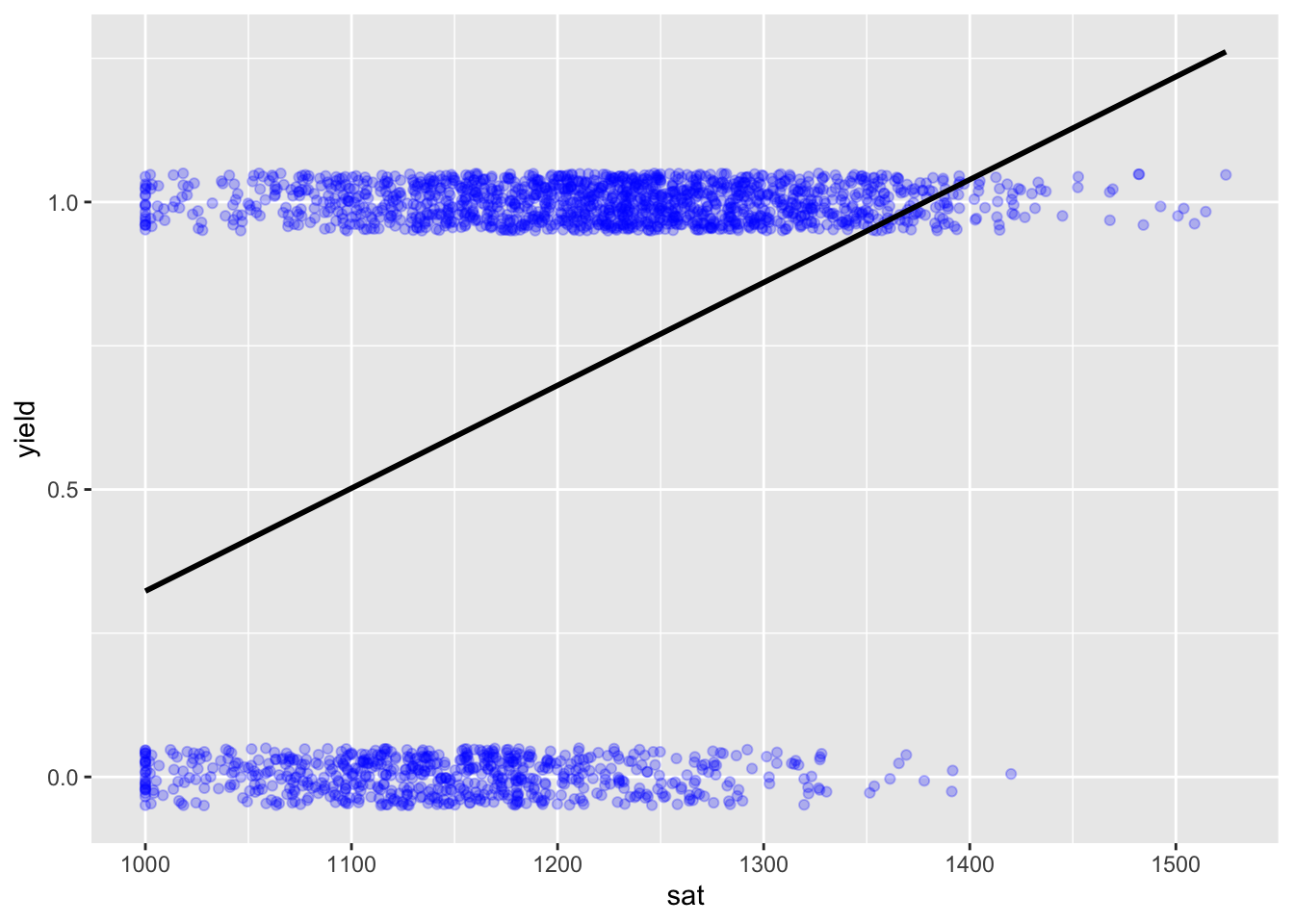
We can see the issue we identified last time: we CAN fit a model, but it doesn’t make a ton of sense. In particular, it doesn’t follow the data very well and it ends up with probabilities outside 0,1.
Generalized Linear Models
What we need is a better function that connects \(y\) to \(x\). The idea of connecting \(y\) to \(x\) with a function other than a simple line is called a generalized linear model.
A posits that the probability that \(y\) is equal to some value is a function of the independent variables and the coefficients or other parameters via a link function:
\(P(y|\mathbf{x})=G(\beta_0 + \mathbf{x_i\beta})\)
In our case, we’re interested in the probability that \(y=1\)
\(P(y=1|\mathbf{x})=G(\beta_0 + \mathbf{x_i\beta})\)
There are several functions that “map” onto a 0,1 continuum. The most commonly used is the logistic function, which gives us the logit model.
The logistic function is given by:
\(f(x)=\frac{1}{1+exp^{-k(x-x_0)}}\)
The Logistic Function: Pr(Y) as a Function of X
x<-runif(100,-3,3)
pr_y=1/(1+exp(-x))
as_tibble(pr_y = pr_y,x = x)%>%
  ggplot(aes(x=x,y=pr_y))+
  geom_smooth()
## `geom_smooth()` using method = 'loess' and formula = 'y ~ x'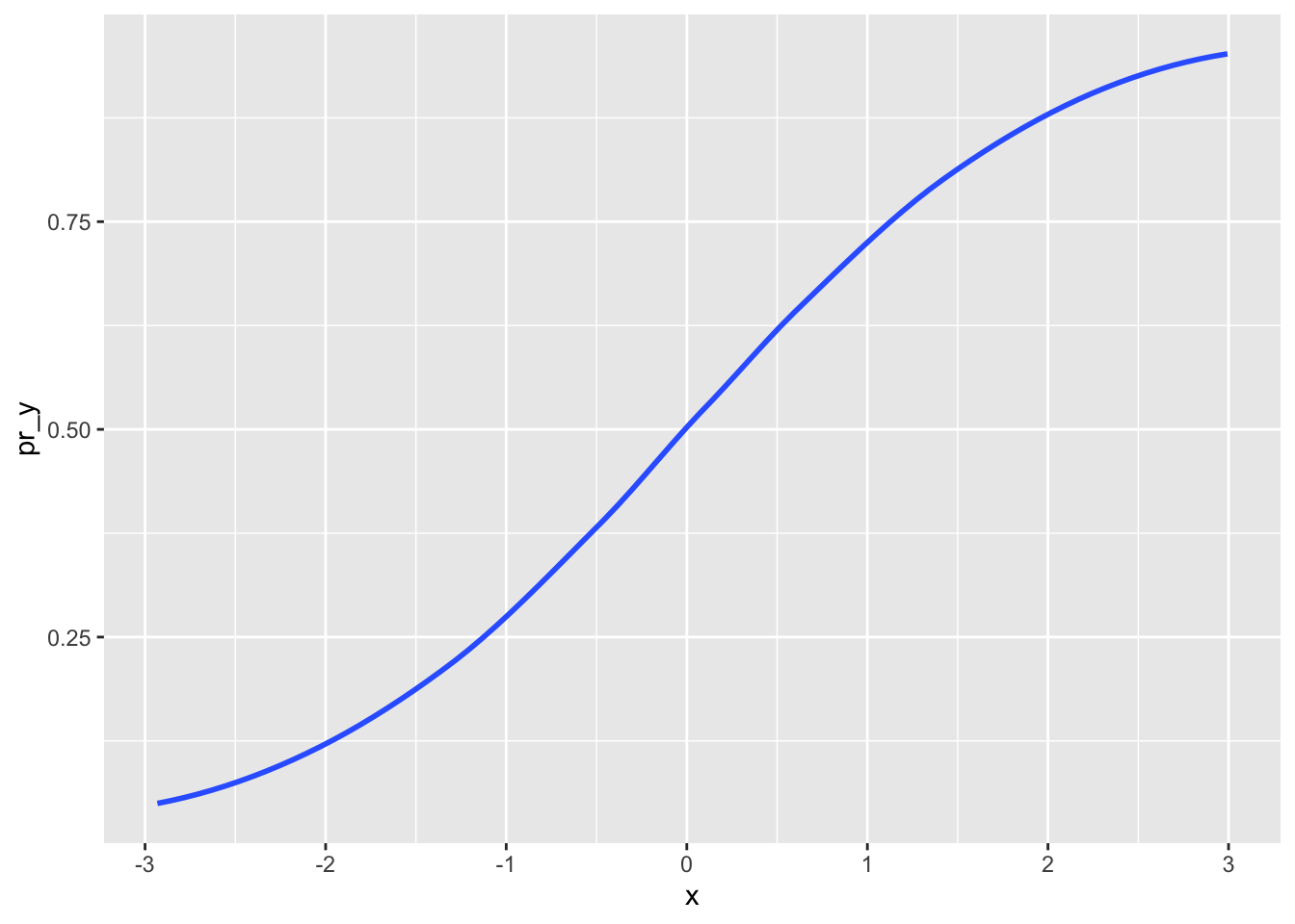
Mapped onto our GLM, this gives us:
\(P(y=1|\mathbf{x})=\frac{exp(\beta_0 + \mathbf{x_i\beta})}{1+exp(\beta_0 +\mathbf{x_i\beta})}\)
The critical thing to note about the above is that the link function maps the entire result of estimation \((\beta_0 + \mathbf{x_i\beta})\) onto the 0,1 continuum. Thus, the change in the \(P(y=1|\mathbf{x})\) is a function of all of the independent variables and coefficients together, one at a time.
What does this mean? It means that the coefficients can only be interpreted on the logit scale, and don’t have the normal interpretation we would use for OLS regression. Instead, to understand what the logistic regression coefficients mean, you’re going to have to convert the entire term \((\beta_0 + \mathbf{x_i\beta})\) to the probability scale, using the inverse of the function. Luckily we have computers to do this for us . . .
If we use this link function on our data, it would look like this: glm(formula,family,data). Notice that it looks very similar to the linear regression function: lm(formula,data).
The only difference is the name of the function (glm() versus lm()) and the additional
input family. This input can take on many different values, but for this class, we only want the logit, which requires family = binomial(link = "logit").
Putting it all together:
Plotting Predictions from Logistic Regression
ad_analysis <- ad %>%
  ungroup() %>%
  select(yield,sat,net_price,legacy) %>%
  drop_na()

m <- glm(yield ~ sat, family = binomial(link = "logit"), data = ad_analysis)# %>% ## Run a glm
summary(m)
##
## Call:
## glm(formula = yield ~ sat, family = binomial(link = "logit"),
## data = ad_analysis)
##
## Coefficients:
## Estimate Std. Error z value Pr(>|z|)
## (Intercept) -1.077e+01 6.965e-01 -15.46 <2e-16 ***
## sat 9.730e-03 5.926e-04 16.42 <2e-16 ***
## ---
## Signif. codes: 0 '***' 0.001 '**' 0.01 '*' 0.05 '.' 0.1 ' ' 1
##
## (Dispersion parameter for binomial family taken to be 1)
##
## Null deviance: 2689.5 on 2149 degrees of freedom
## Residual deviance: 2353.7 on 2148 degrees of freedom
## AIC: 2357.7
##
## Number of Fisher Scoring iterations: 4How to interpret? It is more complicated than a linear regression model, and beyond what you are expected to know in an intro to data science class. We cannot say that each additional SAT score point corresponds to a 0.000973 increase in yield. However, we can conclude that there is a (1) positive and (2) statistically significant association between SAT scores and attending.
In this class…just focus on the sign of the coefficient and the p-value.
Quick Exercise 1: Replicate the above model using distance as a predictor and comment on what it tells you
## INSERT CODE HEREAs you’re getting started, this is what we recommend with these models:
- Use coefficient estimates for sign and significance only–don’t try and come up with a substantive interpretation.
- Generate probability estimates based on characteristics for substantive interpretations.
Evaluating
Since the outcome is binary, we want to evaluate our model on the basis of sensitivity, specificity, and accuracy. To get started, let’s generate predictions again.
NOTE: when predicting a glm() model, set type = "response"!
m <- glm(yield ~ sat, family = binomial(link = "logit"), data = ad_analysis)# %>% ## Run a glm
summary(m)
##
## Call:
## glm(formula = yield ~ sat, family = binomial(link = "logit"),
## data = ad_analysis)
##
## Coefficients:
## Estimate Std. Error z value Pr(>|z|)
## (Intercept) -1.077e+01 6.965e-01 -15.46 <2e-16 ***
## sat 9.730e-03 5.926e-04 16.42 <2e-16 ***
## ---
## Signif. codes: 0 '***' 0.001 '**' 0.01 '*' 0.05 '.' 0.1 ' ' 1
##
## (Dispersion parameter for binomial family taken to be 1)
##
## Null deviance: 2689.5 on 2149 degrees of freedom
## Residual deviance: 2353.7 on 2148 degrees of freedom
## AIC: 2357.7
##
## Number of Fisher Scoring iterations: 4ad_analysis%>%
mutate(preds = predict(m,type = 'response')) %>% # Predicting our new model
mutate(pred_attend = ifelse(preds > .5,1,0)) %>% # Converting predicted probabilities into 1s and 0s
group_by(yield)%>%
mutate(total_attend=n())%>%
group_by(yield,pred_attend)%>%
summarize(n(),`Actual Group`=mean(total_attend))%>%
mutate(Proportion=`n()`/`Actual Group`)%>%
rename(`Actually Attended`=yield,
`Predicted to Attend`=pred_attend,
`Number of Students`=`n()`)## `summarise()` has grouped output by 'yield'. You can override using the
## `.groups` argument.## # A tibble: 4 × 5
## # Groups: Actually Attended [2]
## `Actually Attended` `Predicted to Attend` `Number of Students` `Actual Group`
## <int> <dbl> <int> <dbl>
## 1 0 0 220 684
## 2 0 1 464 684
## 3 1 0 173 1466
## 4 1 1 1293 1466
## # ℹ 1 more variable: Proportion <dbl>Our sensitivity is 0.88 or 88%, our specificity is 0.32 or 32%, and our overall accuracy is (220 + 1293) / 2150 or 0.70 (70%).
The Thresholds
Note that we required a “threshold” to come up with these measures of sensitivity, specificity, and accuracy. Specifically, we relied on a coin toss. If the predicted probability of attending was greater than 50%, we assumed that the student would attend, otherwise they wouldn’t. But this choice doesn’t always have to be 50%. We can choose a number of different thresholds.
ad_analysis%>%
  mutate(preds = predict(m,type = 'response')) %>% # Predicting our new model
  mutate(pred_attend = ifelse(preds > .35,1,0)) %>% # A lower threshold of 0.35 means that more students are predicted to attend
  group_by(yield)%>%
  mutate(total_attend=n())%>%
  group_by(yield,pred_attend)%>%
  summarize(n(),`Actual Group`=mean(total_attend))%>%
  mutate(Proportion=`n()`/`Actual Group`)%>%
  rename(`Actually Attended`=yield,
         `Predicted to Attend`=pred_attend,
         `Number of Students`=`n()`)
## `summarise()` has grouped output by 'yield'. You can override using the
## `.groups` argument.## # A tibble: 4 × 5
## # Groups: Actually Attended [2]
## `Actually Attended` `Predicted to Attend` `Number of Students` `Actual Group`
## <int> <dbl> <int> <dbl>
## 1 0 0 73 684
## 2 0 1 611 684
## 3 1 0 51 1466
## 4 1 1 1415 1466
## # ℹ 1 more variable: Proportion <dbl>ad_analysis%>%
mutate(preds = predict(m,type = 'response')) %>% # Predicting our new model
mutate(pred_attend = ifelse(preds > .75,1,0)) %>% # A higher threshold of 0.75 means that fewer students are predicted to attend
group_by(yield)%>%
mutate(total_attend=n())%>%
group_by(yield,pred_attend)%>%
summarize(n(),`Actual Group`=mean(total_attend))%>%
mutate(Proportion=`n()`/`Actual Group`)%>%
rename(`Actually Attended`=yield,
`Predicted to Attend`=pred_attend,
`Number of Students`=`n()`)## `summarise()` has grouped output by 'yield'. You can override using the
## `.groups` argument.## # A tibble: 4 × 5
## # Groups: Actually Attended [2]
## `Actually Attended` `Predicted to Attend` `Number of Students` `Actual Group`
## <int> <dbl> <int> <dbl>
## 1 0 0 566 684
## 2 0 1 118 684
## 3 1 0 661 1466
## 4 1 1 805 1466
## # ℹ 1 more variable: Proportion <dbl>So how do we determine the optimal threshold? Loop over different choices!
threshRes <- NULL

for(thresh in seq(0,1,by = .05)) { # Loop over values between zero and one, increasing by 0.05
  tmp <- ad_analysis%>%
  mutate(preds = predict(m,type = 'response')) %>% # Predicting our new model
  mutate(pred_attend = ifelse(preds > thresh,1,0)) %>% # Plug in our threshold value
  group_by(yield)%>%
  mutate(total_attend=n())%>%
  group_by(yield,pred_attend)%>%
  summarize(n(),`Actual Group`=mean(total_attend),.groups = 'drop')%>%
  mutate(Proportion=`n()`/`Actual Group`)%>%
  rename(`Actually Attended`=yield,
         `Predicted to Attend`=pred_attend,
         `Number of Students`=`n()`) %>%
    mutate(threshold = thresh)

  threshRes <- threshRes %>% bind_rows(tmp)
}

threshRes %>%
  mutate(metric = ifelse(`Actually Attended` == 1 & `Predicted to Attend` == 1,'Sensitivity',
                         ifelse(`Actually Attended` == 0 & `Predicted to Attend` == 0,'Specificity',NA))) %>%
  drop_na() %>%
  ggplot(aes(x = threshold,y = Proportion,color = metric)) +
  geom_line() +
  geom_vline(xintercept = .67)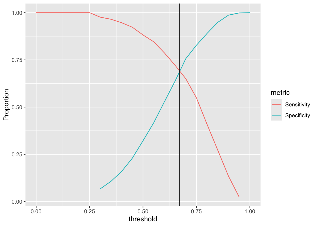
The optimal threshold is the one that maximizes Sensitivity and Specificity! (Although this is use-case dependent. You might prefer to do better on accurately predicting those who do attend than you do about predicting those who don’t.) In this case it is about 0.67.
The ROC curve
As the preceding plot makes clear, there is a trade-off between sensitivity and specificity. We can visualize this trade-off by putting 1-specificity on the x-axis, and sensitivity on the y-axis, to create the “Receiver-Operator Characteristic (ROC) Curve”.
threshRes %>%
  mutate(metric = ifelse(`Actually Attended` == 1 & `Predicted to Attend` == 1,'Sensitivity',
                         ifelse(`Actually Attended` == 0 & `Predicted to Attend` == 0,'Specificity',NA))) %>%
  drop_na() %>%
  select(Proportion,metric,threshold) %>%
  spread(metric,Proportion) %>% # Create two columns, one for spec, the other for sens
  ggplot(aes(x = 1-Specificity,y = Sensitivity)) + # X-axis is 1-Specificity
  geom_line() +
  xlim(c(0,1)) + ylim(c(0,1)) +
  geom_abline(slope = 1,intercept = 0,linetype = 'dotted') # The curve is always evaluated in reference to the diagonal line.
## Warning: Removed 7 rows containing missing values or values outside the scale range
## (`geom_line()`).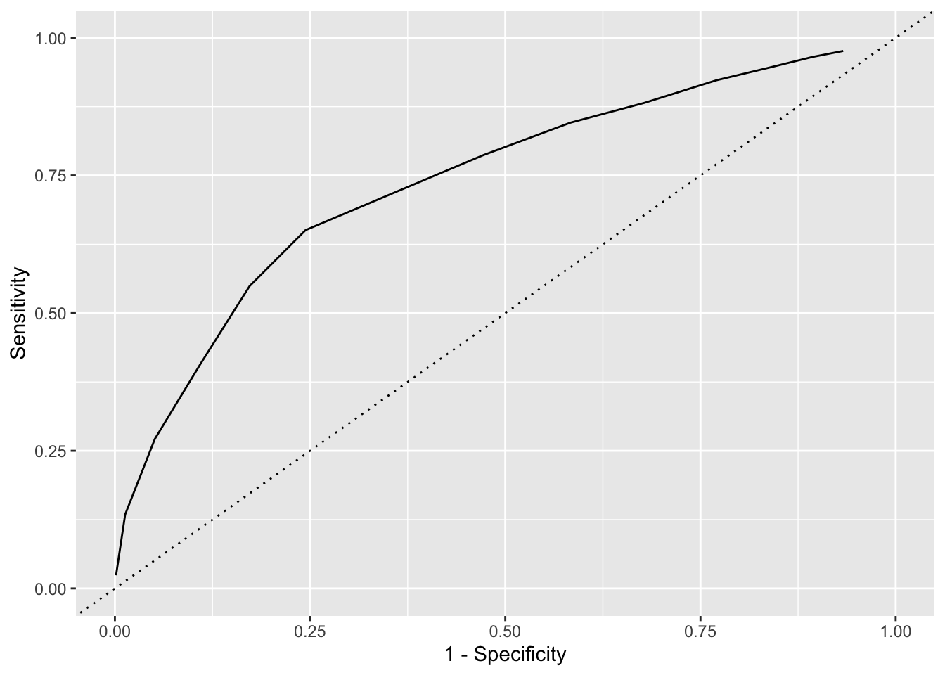
The idea is that a model that is very predictive will have high levels of sensitivity AND high levels of specificity at EVERY threshold. Such a model will cover most of the available area above the baseline of .5. A model with low levels of sensitivity and low levels of specificity at every threshold will cover almost none of the available area above the baseline of .5.
As such, we can extract a single number that captures the quality of our model from this plot: the “Area Under the Curve” (AUC). The further away from the diagonal line is our ROC curve, the better our model performs, and the higher is the AUC. But how to calculate the AUC? Thankfully, there is a helpful R package that will do this for us: tidymodels.
require(tidymodels)
roc_auc(data = ad_analysis %>%
  mutate(pred_attend = predict(m,type = 'response'),
         truth = factor(yield,levels = c('1','0'))) %>% # Make sure the outcome is converted to factors with '1' first and '0' second!
  select(truth,pred_attend),truth,pred_attend)
## # A tibble: 1 × 3
## .metric .estimator .estimate
## <chr> <chr> <dbl>
## 1 roc_auc binary 0.742Our curve covers almost 75% of the total area above the diagonal line. Is this good?
Just like with RMSE, you are primarily interested in the AUC measure to compare different models against each other.
But if you HAVE to, it turns out that – in general – interpreting AUC is just like interpreting academic grades:
Below .6= bad (F)
.6-.7= still not great (D)
.7-.8= Ok . .. (C)
.8-.9= Pretty good (B)
.9-1= Very good fit (A)
Quick Exercise 2: Rerun the model with sent_scores added: does it improve model fit?
# INSERT CODE HEREWrite answer here.
Cross Validation
Just like RMSE calculated on the full data risks overfitting, AUC does also.
How to overcome? Cross validation!
set.seed(123)
cvRes <- NULL
for(i in 1:100) {
  # Cross validation prep
  inds <- sample(1:nrow(ad_analysis),size = round(nrow(ad_analysis)*.8),replace = F)
  train <- ad_analysis %>% slice(inds)
  test <- ad_analysis %>% slice(-inds)

  # Training models
  m1 <- glm(yield ~ sat,family = binomial(link = "logit"),train)

  # Predicting models
  toEval <- test %>%
    mutate(m1Preds = predict(m1,newdata = test,type = 'response'),
           truth = factor(yield,levels = c('1','0')))

  # Evaluating models
  rocRes <- roc_auc(data = toEval,truth = truth,m1Preds)
  cvRes <- rocRes %>%
    mutate(bsInd = i) %>%
    bind_rows(cvRes)
}

mean(cvRes$.estimate)
## [1] 0.7404506Thinking About Policy Change in Admissions
Once we have a model that can predict an outcome, we can also run some simulations using our existing data to understand what would happen if we implemented different policies. In this class we’re going to go over how to generate predictions using hypothetical data at different levels of complexity. This is helpful to understand the implications of different models. It’s particularly helpful in the context of logistic regression, as the coefficients from a logistic regression are difficult to understand on their own. Once we feel like we have a handle on the relationship between the variables and the outcome, we can try changing policies to see what the new predictions might look like.
We’ll start by loading in our standard libraries, plus the modelr library, and getting the data set up.
library(modelr)
library(tidyverse)
library(tidymodels)ad<-read_rds("https://github.com/rweldzius/PSC4175/raw/main/static/data/admit_data.rds")Data Wrangling
ad<-ad%>%
  mutate(yield_f=as_factor(ifelse(yield==1,"Yes","No")))%>%
  mutate(yield_f=relevel(yield_f,ref="No"))%>%
    mutate(sat=sat/100,
         income=income/1000,
         distance=distance/1000,
         net_price=net_price/1000)
Settting the Model
Today I’m going to use a more fully specified logit model. We’ll include most of the variables in the dataset, then fit the model and take a look at the coefficients.
admit_formula <- as.formula(
                  "yield_f~
                          legacy+
                          visit+
                          registered+
                          sent_scores+
                          sat+
                          income+
                          gpa+
                          distance+
                          net_price")
Fit the Model
m <- glm(formula = admit_formula,
         family = binomial(link = 'logit'),
         data = ad)
## Warning: glm.fit: fitted probabilities numerically 0 or 1 occurredtidy(m) # Easier to read regression output (same as summary(m))## # A tibble: 10 × 5
## term estimate std.error statistic p.value
## <chr> <dbl> <dbl> <dbl> <dbl>
## 1 (Intercept) -8.96 1.52 -5.89 3.87e- 9
## 2 legacy 0.514 0.153 3.35 8.11e- 4
## 3 visit 0.285 0.135 2.11 3.53e- 2
## 4 registered 0.461 0.132 3.50 4.64e- 4
## 5 sent_scores 0.730 0.179 4.08 4.48e- 5
## 6 sat -0.0444 0.126 -0.352 7.25e- 1
## 7 income 0.0513 0.00311 16.5 3.10e-61
## 8 gpa 1.77 0.337 5.26 1.41e- 7
## 9 distance -1.53 0.346 -4.41 1.04e- 5
## 10 net_price -0.0559 0.00761 -7.35 1.93e-13Current Institutional Policies
(This is a recap from lecture 1)
Essentially every private college engages heavily in tuition discounting. This has two basic forms: need-based aid and merit-based aid. Need-based aid is provided on the basis of income, typically with some kind of income cap. Merit-based aid is based on demonstrated academic qualifications, again usually with some kind of minimum. Here’s this institution’s current policies.
The institution is currently awarding need-based aid for families making less than $100,0000 on the following formula:
\(need_aid=500+(income/1000-100)\*-425\)
Translated, this means for every $1,000 the family makes less than $100,000 the student receives an additional 425 dollars. So for a family making $50,000, need-based aid will be \(500+(50,000/1000-100)*-425= 500+ (-50*-425)\)=$21,750. Need based aid is capped at total tuition.
ad%>%
  ggplot(aes(x=income,y=need_aid))+
  geom_point()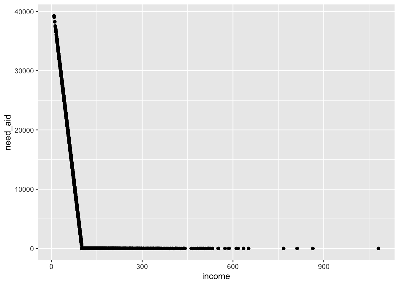
The institution is currently awarding merit-based aid for students with SAT scores above 1250 on the following formula:
\(merit_aid=500+(sat/10\*250)\)
Translated, this means that for every 10 points in SAT scores above 1250, the student will receive an additional $250. So for a student with 1400 SAT, merit based aid will be : \(500+ (1400/10 *250)= 500+140*250\)
ad%>%
  ggplot(aes(x=sat,y=merit_aid))+
  geom_point()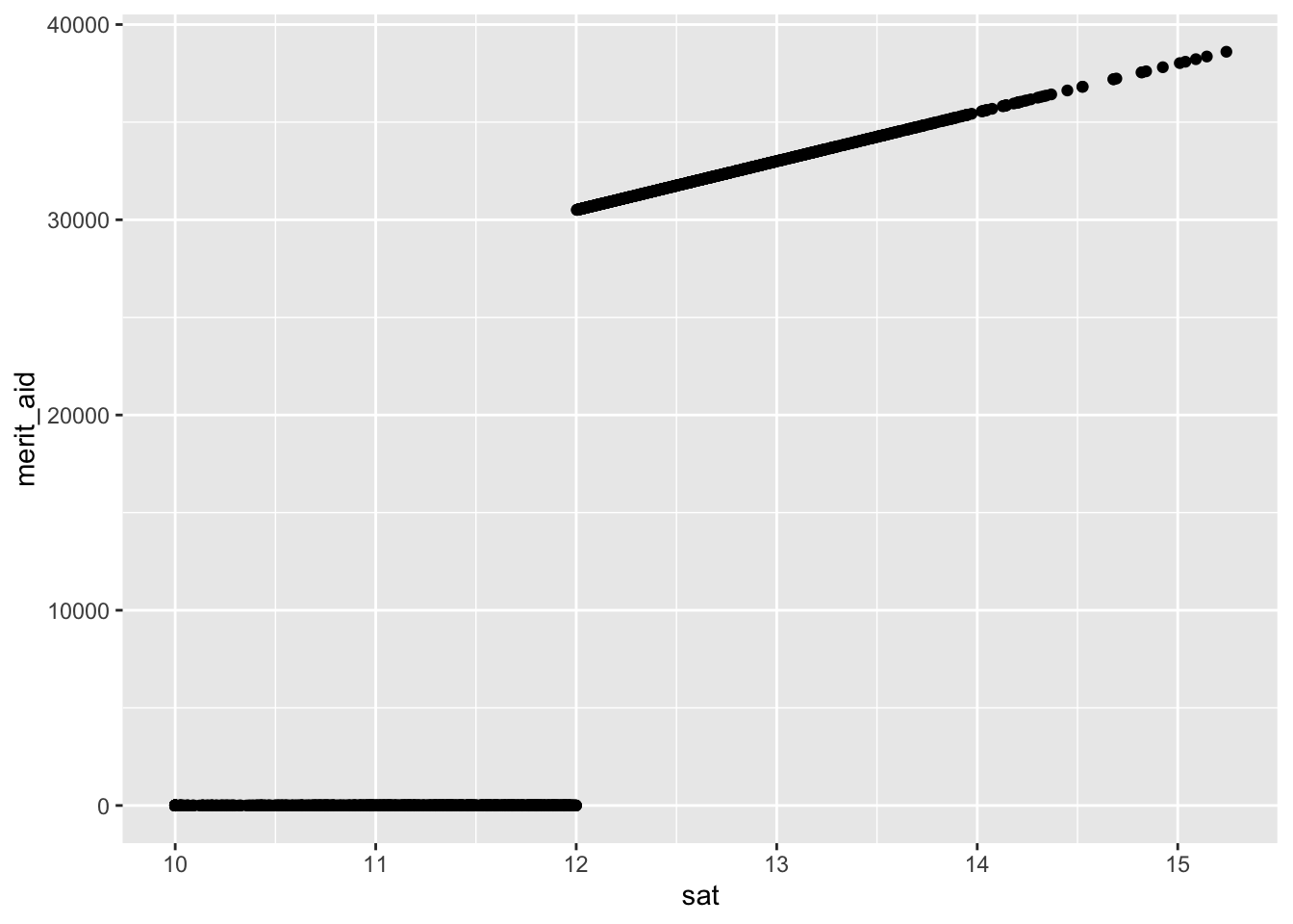
Probability for a Specific Case
The first thing we’ll do is to generate a predicted probability of yield for a particular type of case. Let’s take a look at the predicted probability of enrolling for an individual who:
- Is not a legacy (legacy=0)
- Visited Campus (visit=1)
- Registered on the college website (register=1)
- Did not send scores in advance of applying (sent_scores=1)
- Has an SAT score of 1400 (sat=14)
- Has a family income of $95,000 (income=95)
- Has a GPA of 3.9 (gpa=3.9)
- Lives 100 miles from campus (distance=.1)
- Net Price of 6,875
According to our policy, someone with this set of characteristics would receive
\(need_aid=500+(income/1000-100)\*-425\)= 2625 in need-based aid, and
\(merit_aid=500+(sat/10\*250)\)= 35,500 in merit based aid, so their net price would be:
45000-2625-35,500= 6,875
We will use the data_grid command. This command allows us to specify values of the
covariates in a model so that we can then use these to get a predicted probability from the model.
hypo_data <- ad %>%
  data_grid(legacy=0,
            visit=1,
            registered=1,
            sent_scores=1,
            sat=14,
            income=95,
            gpa=3.9,
            distance=.1,
            net_price=6.875
            )
data.frame(prob_attend = predict(m,newdata = hypo_data,type="response")) %>%
bind_cols(hypo_data)## prob_attend legacy visit registered sent_scores sat income gpa distance
## 1 0.9587473 0 1 1 1 14 95 3.9 0.1
## net_price
## 1 6.875Quick Exercise 3: What’s the probability that the same student would attend if we increased their net price by 10k?
# INSERT CODE HEREChange in Probability for Two Cases
With the data_grid command, we can ask for results back for many combinations of values. Let’s check to see what happens in the above case if we compare individuals who did and did not send their scores.
hypo_data <- ad %>%
data_grid(legacy=0,
visit=1,
registered=1,
sent_scores=c(0,1),
sat=14,
income=95,
gpa=3.9,
distance=.1,
net_price=6.875
)data.frame(prob_attend = predict(m,newdata = hypo_data,type="response")) %>%
bind_cols(hypo_data)## prob_attend legacy visit registered sent_scores sat income gpa distance
## 1 0.9180167 0 1 1 0 14 95 3.9 0.1
## 2 0.9587473 0 1 1 1 14 95 3.9 0.1
## net_price
## 1 6.875
## 2 6.875Quick Exercise 4: What’s the difference in probability for students who did and didn’t visit campus
# INSERT CODE HEREUsing Default Values
One really powerful aspect of data_grid is that we don’t have to specify the value of every variable. Instead, we can use supply the model to data_grid and it will use the default values. Let’s say we just want a prediction for someone with mean or modal value for all of the characteristics. We can use data_grid with the model argument to get this:
hypo_data <- ad %>%
data_grid(.model=m)data.frame(prob_attend = predict(m,newdata = hypo_data,type="response")) %>%
bind_cols(hypo_data)## prob_attend legacy visit registered sent_scores sat income gpa
## 1 0.8655441 0 0 1 0 12.00089 99.71213 3.790439
## distance net_price
## 1 0.1002338 14.10675Quick Exercise 5: generate probabilities for individuals who are both at the mean or mode of all variables, but have a gpa of 3.5 and 3.9.
hypo_data <- ad %>%
data_grid(.model=m,
gpa=c(3.5,3.9))
data.frame(prob_attend = predict(m,newdata = hypo_data,type="response")) %>%
  bind_cols(hypo_data)
## prob_attend gpa legacy visit registered sent_scores sat income
## 1 0.7936923 3.5 0 0 1 0 12.00089 99.71213
## 2 0.8865843 3.9 0 0 1 0 12.00089 99.71213
## distance net_price
## 1 0.1002338 14.10675
## 2 0.1002338 14.10675Probabilities Across a Range of Cases
The other thing we can do is to generate probabilities for a range of a continuous variable. The seq_range variable allows us to go from the minimum to the maximum of a given variable in a specified number of steps. Below I go from the minimum gpa to the maximum gpa in 100 steps, for both legacy and non-legacy students, with all other values held at their mean or mode.
hypo_data <- ad %>%
  data_grid(gpa = seq_range(gpa, n = 100),
            legacy=c(0,1),
            .model=m)
We can then plot that data as follows:
plot_data<-data.frame(prob_attend = predict(m,newdata = hypo_data,type="response")) %>%
  bind_cols(hypo_data)

plot_data%>%
ggplot(aes(x=gpa,y=prob_attend,color=as_factor(legacy)))+
  geom_line()+
  ylab("Prob(Attend)")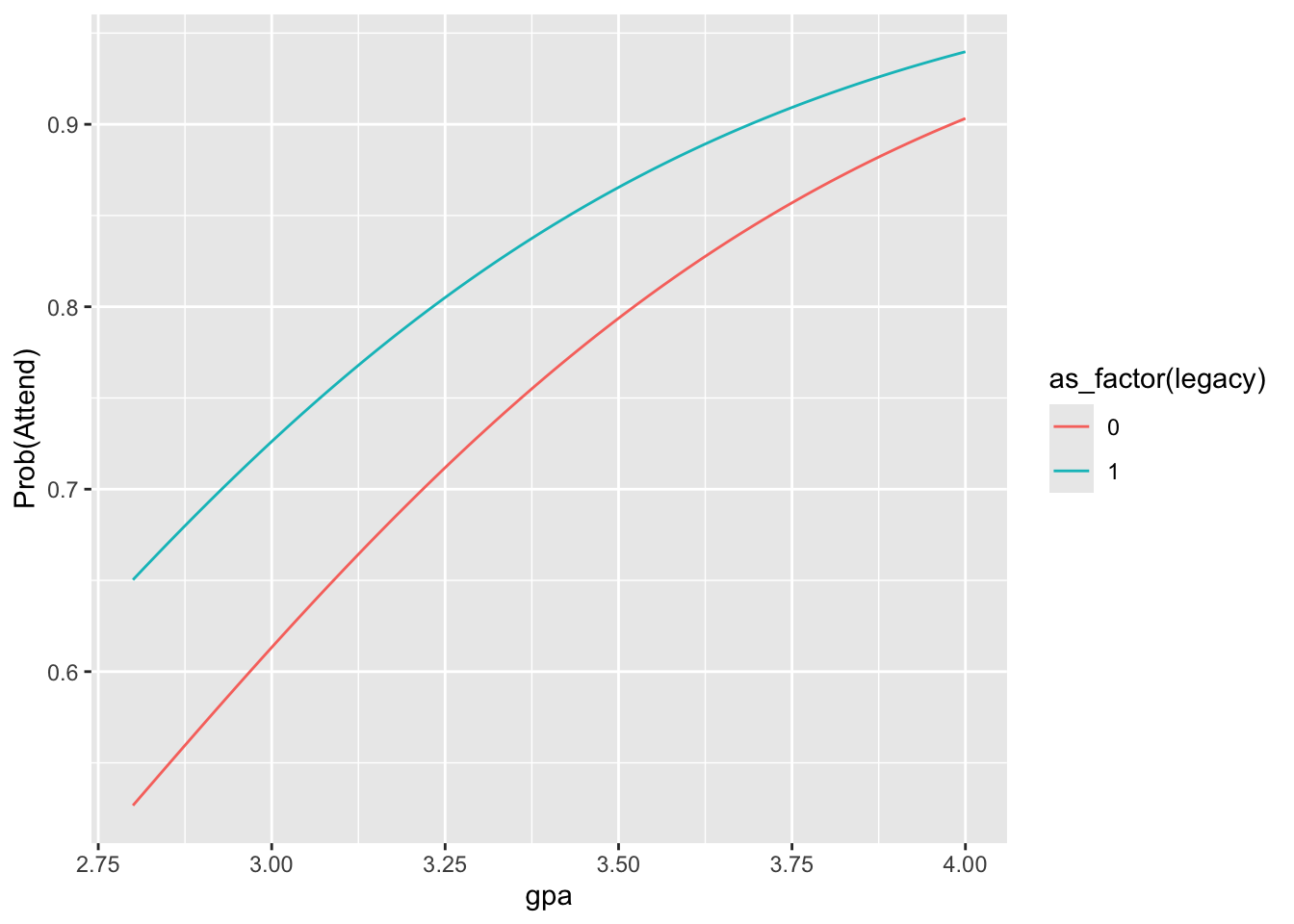
Quick Exercise 6: Plot the impact of changing distance across its range for those who have and haven’t visited campus
# INSERT CODE HEREThe above tools can allow us to think through the substantive importance of changes in the different variables. This is an important step in these kinds of models, where the coefficients aren’t directly interpretable.
Changing policy
AS we think about changing policy for the campus, we need to answer a series of questions about the key characteristics of the campus right now. Remember that for your assignment we want you to do the the four following things:
The college president and the board of trustees have two strategic goals:
- Increase the average SAT score to 1300
- Admit at least 200 more students with incomes less than $50,000
- Don’t allow tuition revenues from first-year students to drop to less than $30 million
- Keep the number of enrolled students between 1,450 and 1,550
So, what’s the average SAT score?
ad%>%
  filter(yield==1)%>%
  summarize(mean(sat))
## mean(sat)
## 1 12.25941Second, how many currently enrolled students come from families that make less than $50,000 a year?
ad%>%
  filter(yield==1,income<50)%>%
  count()
## n
## 1 77Next how much does the campus collect from first-year students in tuition revenue?
ad%>%
  filter(yield==1)%>%
  summarize(dollar(sum(net_price)))
## dollar(sum(net_price))
## 1 $30,674.15And how many students currently yield?
ad%>%
  filter(yield==1)%>%
  count()
## n
## 1 1466What we want to do now is to think about how changing policies might affect all four of these summary measures. Let’s think about changing our financial aid policy for students who sent scores.
data.frame(prob_attend = predict(m,type = 'response')) %>%
  bind_cols(ad)%>%
  mutate(pred_attend = ifelse(prob_attend > .5,1,0)) %>%
  group_by(sent_scores,pred_attend)%>%
  count()
## # A tibble: 4 × 3
## # Groups: sent_scores, pred_attend [4]
## sent_scores pred_attend n
## <dbl> <dbl> <int>
## 1 0 0 627
## 2 0 1 1093
## 3 1 0 75
## 4 1 1 355The model currently predicts that 355 of the 430 students who sent scores will enroll. What happens if we increase their net price by 5,000? I’m going to create a new version of our dataset, with net price increased by 5,000 (5) for everyone who sent scores.
ad_np<-ad%>%
  mutate(net_price=ifelse(sent_scores==1,
                              net_price+5,
                              net_price))
Then I can generate predictions from the dataset, and create a new variable for prob_attend which will classify our variable. Please note that this uses a threshold of .5 by default.
ad_np<-data.frame(prob_attend = predict(m,newdata = ad_np,type = 'response')) %>%
  mutate(pred_attend = ifelse(prob_attend > .5,1,0)) %>%
  bind_cols(ad_np)
How many students who sent scores are now predicted to yield?
ad_np%>%
  group_by(sent_scores,pred_attend)%>%
  count()
## # A tibble: 4 × 3
## # Groups: sent_scores, pred_attend [4]
## sent_scores pred_attend n
## <dbl> <dbl> <int>
## 1 0 0 627
## 2 0 1 1093
## 3 1 0 92
## 4 1 1 338So, we lost about 22 students by increasing the net price. On the other hand, we charged more to the students who did attend.
ad_np%>%
  filter(pred_attend==1)%>%
  summarize(dollar(sum(net_price)))
## dollar(sum(net_price))
## 1 $31,264.66Total revenues went up!
And what happened to overall enrollment?
ad_np%>%
  group_by(pred_attend)%>%
  count()
## # A tibble: 2 × 2
## # Groups: pred_attend [2]
## pred_attend n
## <dbl> <int>
## 1 0 719
## 2 1 1431So, this policy decreased enrollment slightly, but raised 500,000 dollars. Worth it?
Quick Exercise 7: Decrease prices for everyone who lives more than 1500 miles away by 10,000 and summarize the impacts on the campus.
# INSERT CODE HERE