Univariate Analysis and Conditional Relationships
Homework 5
Agenda
Basics of univariate analysis
Conditional data: when a variable varies with respect to some other variable.
How does the value of the outcome of interest vary depending on the value of another variable of interest?
Typically: outcome of interest (dependent variable), Y-axis.
Other variables possibly related to the outcome (independent variables): X-axis
Our tools depend on the type of variables we are trying to graph.
Univariate Data Analysis
Univariate is pretty much what it sounds like: one variable. When undertaking univariate data analysis, we need first and foremost to figure what type of variable it is that we’re working with. Once we do that, we can choose the appropriate use of the variable, either as an outcome or as a possible predictor.
Motivating Question
We’ll be working with data from every NBA player who was active during the 2018-19 season.
Here’s the data:
require(tidyverse)
nba<-read_rds("https://github.com/rweldzius/PSC4175/raw/main/static/data/nba_players_2018.Rds")
This data contains the following variables:
Codebook for NBA Data
| Name | Definition |
|---|---|
| namePlayer | Player name |
| idPlayer | Unique player id |
| slugSeason | Season start and end |
| numberPlayerSeason | Which season for this player |
| isRookie | Rookie season, true or false |
| slugTeam | Team short name |
| idTeam | Unique team id |
| gp | Games Played |
| gs | Games Started |
| fgm | Field goals made |
| fga | Field goals attempted |
| pctFG | Percent of field goals made |
| fg3m | 3 point field goals made |
| fg3a | 3 point field goals attempted |
| pctFG3 | Percent of 3 point field goals made |
| pctFT | Free Throw percentage |
| fg2m | 2 point field goals made |
| fg2a | 2 point field goals attempted |
| pctFG2 | Percent of 2 point field goals made |
| agePlayer | Player age |
| minutes | Minutes played |
| ftm | Free throws made |
| fta | Free throws attempted |
| oreb | Offensive rebounds |
| dreb | Defensive rebounds |
| treb | Total rebounds |
| ast | Assists |
| blk | Blocks |
| tov | Turnovers |
| pf | Personal fouls |
| pts | Total points |
| urlNBAAPI | Source url |
We’re interested in the following questions:
- Do certain colleges produce players that have more field goals? What about free throw percentage above a certain level? Are certain colleges in the east or the west more likely to produce higher scorers? How does this vary as a player has more seasons?
To answer these questions we need to look at the following variables:
- Field goals
- Free throw percentage above .25
- Colleges
- Player seasons
- Region
We’re going to go through a pretty standard set of steps for each variable. First, examine some cases. Second, based on our examination, we’ll try either a plot or a table. Once we’ve seen the plot or the table, we’ll think a bit about ordering, and then choose an appropriate measure of central tendency, and maybe variation.
Types of Variables
It’s really important to understand the types of variables you’re working with. Many times analysts are indifferent to this step particularly with larger datasets. This can lead to a great deal of confusion down the road. Below are the variable types we’ll be working with this semester and the definition of each.
Continuous Variables
A continuous variable can theoretically be subdivided at any arbitrarily small measure and can still be identified. You may have encountered further subdivision of continuous variables into “interval” or “ratio” data in other classes. We RARELY use these distinctions in practice. The distinction between a continuous and a categorical variable is hugely consequential, but the distinction between interval and ratio is not really all that important in practice.
The mean is the most widely used measure of central tendency for a continuous variable. If the distribution of the variable isn’t very symmetric or there are large outliers, then the median is a much better measure of central tendency.
Categorical Variables
A categorical variables divides the sample up into a set of mutually exclusive and exhaustive categories. Mutually exclusive means that each case can only be one, and exhaustive means that the categories cover every possible option. Categorical is sort of the “top” level classification for variables of this type. Within the broad classification of categorical there are multiple types of other variables.
Categorical: ordered
an ordered categorical variable has– you guessed it– some kind of sensible order that can be applied. For instance, the educational attainment of an individual: high school diploma, associates degree, bachelor’s degree, graduate degree– is an ordered categorical variable.
Ordered categorical variables should be arranged in the order of the variable, with proportions or percentages associated with each order. The mode, or the category with the highest proportion, is a reasonable measure of central tendency, but with fewer than ten categories the analyst should generally just show the proportion in each category.
Categorical: ordered, binary
An ordered binary variable has just two levels, but can be ordered. For instance, is a bird undertaking its first migration: yes or no? A “no” means that the bird has more than one.
The mean of a binary variable is exactly the same thing as the proportion of the sample with that characteristic. So, the mean of a binary variable for “first migration” where 1=“yes” will give the proportion of birds migrating for the first time.
An ordered binary variable coded as 0 or 1 can be summarized using the mean which is the same thing as the proportion of the sample with that characteristic.
Categorical: unordered
An unordered categorical variable has no sensible ordering that can be applied. Think about something like college major. There’s no “number” we might apply to philosophy that has any meaningful distance from a number we might apply to chemical engineering.
Unlike an ordered variable, an unordered categorical variable should be ordered in terms of the proportions falling into each of the categories. As with an unordered variable, it’s best just to show the proportions in each category for variables with less than ten levels. The mode is a reasonable single variable summary of an unordered categorical variable.
Categorical: unordered, binary
This kind of variable has no particular order, but can be just binary. A “1” means that the case has that characteristics, a “0” means the case does not have that characteristic. For instance, whether a tree is deciduous or not.
An unordered binary variable coded as 0 or 1 can also be summarized by the mean, which is the same thing as the proportion of the sample with that characteristic.
Formats for categorical variables
In R, categorical variables CAN be stored as text, numbers or even logicals. Don’t count on the data to help you out– you as the analyst need to figure this out.
Factors
We probably need to talk about factors.
The Process: #TrustTheProcess
I’m going to walk you through how an analyst might typically decide what type of variables they’re working with. It generally works like this:
- Take a look at a few observations and form a guess as to what type of variable it is.
- Based on that guess, create an appropriate plot or table.
- If the plot or table looks as expected, calculate some summary measures. If not, go back to 1.
“Glimpse” to start: what’s in here anyway?
The first thing we’re going to do with any dataset is just to take a quick look. We can call the data itself, but that will just show the first few cases and the first few variables. Far better is the glimpse command, which shows us all variables and the first few observations for all of the variables. Here’s a link to the codebook for this dataset:
The six variables we’re going to think about are field goals, free throw percentage, seasons played, rookie season, college attended, and conference played in.
glimpse(nba)## Rows: 530
## Columns: 37
## $ namePlayer <chr> "LaMarcus Aldridge", "Quincy Acy", "Steven Adams", …
## $ idPlayer <dbl> 200746, 203112, 203500, 203518, 1628389, 1628959, 1…
## $ slugSeason <chr> "2018-19", "2018-19", "2018-19", "2018-19", "2018-1…
## $ numberPlayerSeason <dbl> 12, 6, 5, 2, 1, 0, 0, 0, 0, 0, 8, 5, 4, 3, 1, 1, 1,…
## $ isRookie <lgl> FALSE, FALSE, FALSE, FALSE, FALSE, TRUE, TRUE, TRUE…
## $ slugTeam <chr> "SAS", "PHX", "OKC", "OKC", "MIA", "CHI", "UTA", "C…
## $ idTeam <dbl> 1610612759, 1610612756, 1610612760, 1610612760, 161…
## $ gp <dbl> 81, 10, 80, 31, 82, 10, 38, 19, 34, 7, 81, 72, 43, …
## $ gs <dbl> 81, 0, 80, 2, 28, 1, 2, 3, 1, 0, 81, 72, 40, 4, 80,…
## $ fgm <dbl> 684, 4, 481, 56, 280, 13, 67, 11, 38, 3, 257, 721, …
## $ fga <dbl> 1319, 18, 809, 157, 486, 39, 178, 36, 110, 10, 593,…
## $ pctFG <dbl> 0.519, 0.222, 0.595, 0.357, 0.576, 0.333, 0.376, 0.…
## $ fg3m <dbl> 10, 2, 0, 41, 3, 3, 32, 6, 25, 0, 96, 52, 9, 24, 6,…
## $ fg3a <dbl> 42, 15, 2, 127, 15, 12, 99, 23, 74, 4, 280, 203, 34…
## $ pctFG3 <dbl> 0.2380952, 0.1333333, 0.0000000, 0.3228346, 0.20000…
## $ pctFT <dbl> 0.847, 0.700, 0.500, 0.923, 0.735, 0.667, 0.750, 1.…
## $ fg2m <dbl> 674, 2, 481, 15, 277, 10, 35, 5, 13, 3, 161, 669, 1…
## $ fg2a <dbl> 1277, 3, 807, 30, 471, 27, 79, 13, 36, 6, 313, 1044…
## $ pctFG2 <dbl> 0.5277995, 0.6666667, 0.5960347, 0.5000000, 0.58811…
## $ agePlayer <dbl> 33, 28, 25, 25, 21, 21, 23, 22, 23, 26, 28, 24, 25,…
## $ minutes <dbl> 2687, 123, 2669, 588, 1913, 120, 416, 194, 428, 22,…
## $ ftm <dbl> 349, 7, 146, 12, 166, 8, 45, 4, 7, 1, 150, 500, 37,…
## $ fta <dbl> 412, 10, 292, 13, 226, 12, 60, 4, 9, 2, 173, 686, 6…
## $ oreb <dbl> 251, 3, 391, 5, 165, 11, 3, 3, 11, 1, 112, 159, 48,…
## $ dreb <dbl> 493, 22, 369, 43, 432, 15, 20, 16, 49, 3, 498, 739,…
## $ treb <dbl> 744, 25, 760, 48, 597, 26, 23, 19, 60, 4, 610, 898,…
## $ ast <dbl> 194, 8, 124, 20, 184, 13, 25, 5, 65, 6, 104, 424, 1…
## $ stl <dbl> 43, 1, 117, 17, 71, 1, 6, 1, 14, 2, 68, 92, 54, 22,…
## $ blk <dbl> 107, 4, 76, 6, 65, 0, 6, 4, 5, 0, 33, 110, 37, 13, …
## $ tov <dbl> 144, 4, 135, 14, 121, 8, 33, 6, 28, 2, 72, 268, 58,…
## $ pf <dbl> 179, 24, 204, 53, 203, 7, 47, 13, 45, 4, 143, 232, …
## $ pts <dbl> 1727, 17, 1108, 165, 729, 37, 211, 32, 108, 7, 760,…
## $ urlNBAAPI <chr> "https://stats.nba.com/stats/playercareerstats?Leag…
## $ n <int> 1, 1, 1, 1, 1, 1, 1, 1, 1, 1, 1, 1, 1, 1, 1, 1, 1, …
## $ org <fct> Texas, NA, Other, FC Barcelona Basquet, Kentucky, N…
## $ country <chr> NA, NA, NA, "Spain", NA, NA, NA, NA, NA, NA, NA, "S…
## $ idConference <int> 2, 2, 2, 2, 1, 1, 2, 1, 1, 2, 2, 1, 2, 1, 1, 1, 1, …Continuous
Let’s start by taking a look at field goals. It seems pretty likely that this is a continuous variable. Let’s take a look at the top 50 spots.
nba%>% ## Start with the dataset
  select(namePlayer,slugTeam,fgm)%>% ## and then select a few variables
  arrange(-fgm)%>% ## arrange in reverse order of field goals
  print(n=50) ## print out the top 50
## # A tibble: 530 × 3
## namePlayer slugTeam fgm
## <chr> <chr> <dbl>
## 1 James Harden HOU 843
## 2 Bradley Beal WAS 764
## 3 Kemba Walker CHA 731
## 4 Giannis Antetokounmpo MIL 721
## 5 Kevin Durant GSW 721
## 6 Paul George OKC 707
## 7 Nikola Vucevic ORL 701
## 8 LaMarcus Aldridge SAS 684
## 9 Damian Lillard POR 681
## 10 Karl-Anthony Towns MIN 681
## 11 Donovan Mitchell UTA 661
## 12 D'Angelo Russell BKN 659
## 13 Klay Thompson GSW 655
## 14 Stephen Curry GSW 632
## 15 DeMar DeRozan SAS 631
## 16 Russell Westbrook OKC 630
## 17 Buddy Hield SAC 623
## 18 Blake Griffin DET 619
## 19 Nikola Jokic DEN 616
## 20 Tobias Harris MIN 611
## 21 Kyrie Irving BOS 604
## 22 Devin Booker PHX 586
## 23 Joel Embiid PHI 580
## 24 CJ McCollum POR 571
## 25 Julius Randle NOP 571
## 26 Andre Drummond DET 561
## 27 Kawhi Leonard TOR 560
## 28 LeBron James LAL 558
## 29 Jrue Holiday NOP 547
## 30 Montrezl Harrell LAC 546
## 31 Ben Simmons PHI 540
## 32 Anthony Davis NOP 530
## 33 Zach LaVine CHI 530
## 34 Jordan Clarkson CLE 529
## 35 Trae Young ATL 525
## 36 Bojan Bogdanovic IND 522
## 37 Pascal Siakam TOR 519
## 38 Collin Sexton CLE 519
## 39 Jamal Murray DEN 513
## 40 Deandre Ayton PHX 509
## 41 Luka Doncic DAL 506
## 42 Khris Middleton MIL 506
## 43 De'Aaron Fox SAC 505
## 44 Andrew Wiggins MIN 498
## 45 Kyle Kuzma LAL 496
## 46 Mike Conley MEM 490
## 47 Lou Williams LAC 484
## 48 Steven Adams OKC 481
## 49 Rudy Gobert UTA 476
## 50 Clint Capela HOU 474
## # ℹ 480 more rowsSo what I’m seeing here is that field goals aren’t “clumped” at certain levels. Let’s confirm that by looking at a kernel density plot.
nba%>%
  ggplot(aes(x=fgm))+
  geom_density()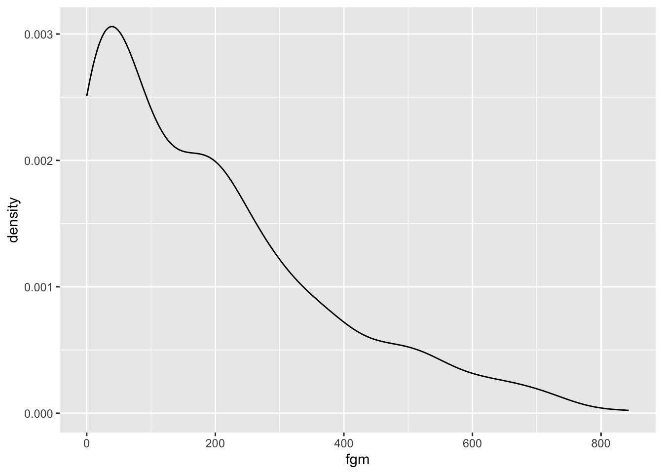
We can also use a histogram to figure out much the same thing.
nba%>%
  ggplot(aes(x=fgm))+
  geom_histogram()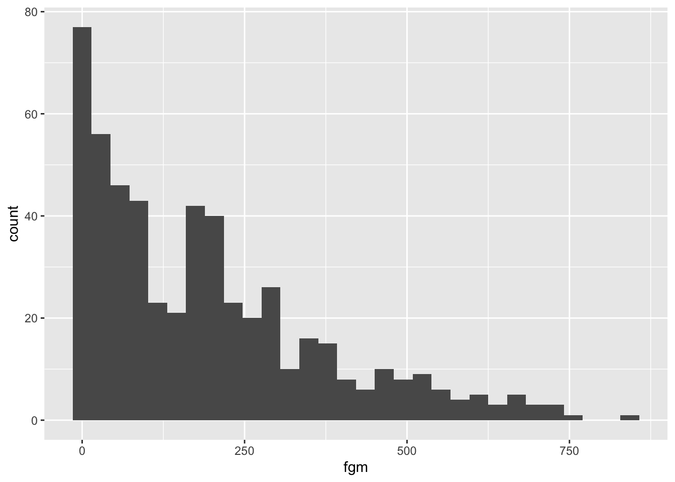
Now, technically field goals don’t meet the definition I set out above as being a continuous variable because they aren’t divisible below a certain amount. Usually in practice though we just ignore this– this variable is “as good as” continuous, given that it varies smoothly over the range and isn’t confined to a relatively small set of possible values.
Quick Exercise 1: Do the same thing for field goal percentage and think about what kind of variable it is.
# INSERT CODE HEREMeasures for Continuous Variables
The mean is used most of the time for continuous variables, but it’s VERY sensitive to outliers. The median (50th percentile) is usually better, but it can be difficult to explain to general audiences.
nba%>%
  summarize(mean_fgm=mean(fgm))
## # A tibble: 1 × 1
## mean_fgm
## <dbl>
## 1 191.nba%>%
summarize(median_fgm=median(fgm))## # A tibble: 1 × 1
## median_fgm
## <dbl>
## 1 157In this case I’d really prefer the mean as a single measure of field goal production, but depending on the audience I still might just go ahead and use the median.
Quick Exercise 2 What measure would you prefer for field goal percentage? Calculate that measure.
# INSERT CODE HERECategorical: ordered
Let’s take a look at player seasons.
nba%>%
  select(namePlayer,numberPlayerSeason)%>%
  arrange(-numberPlayerSeason)%>%
  print(n=50)
## # A tibble: 530 × 2
## namePlayer numberPlayerSeason
## <chr> <dbl>
## 1 Vince Carter 20
## 2 Dirk Nowitzki 20
## 3 Jamal Crawford 18
## 4 Tony Parker 17
## 5 Tyson Chandler 17
## 6 Pau Gasol 17
## 7 Nene 16
## 8 Carmelo Anthony 15
## 9 Udonis Haslem 15
## 10 LeBron James 15
## 11 Zaza Pachulia 15
## 12 Dwyane Wade 15
## 13 Kyle Korver 15
## 14 Luol Deng 14
## 15 Devin Harris 14
## 16 Dwight Howard 14
## 17 Andre Iguodala 14
## 18 JR Smith 14
## 19 Trevor Ariza 14
## 20 Andrew Bogut 13
## 21 Jose Calderon 13
## 22 Raymond Felton 13
## 23 Amir Johnson 13
## 24 Shaun Livingston 13
## 25 Chris Paul 13
## 26 Marvin Williams 13
## 27 Lou Williams 13
## 28 CJ Miles 13
## 29 LaMarcus Aldridge 12
## 30 J.J. Barea 12
## 31 Channing Frye 12
## 32 Rudy Gay 12
## 33 Kyle Lowry 12
## 34 Paul Millsap 12
## 35 JJ Redick 12
## 36 Rajon Rondo 12
## 37 Thabo Sefolosha 12
## 38 Marco Belinelli 11
## 39 Mike Conley 11
## 40 Kevin Durant 11
## 41 Jared Dudley 11
## 42 Marcin Gortat 11
## 43 Gerald Green 11
## 44 Al Horford 11
## 45 Joakim Noah 11
## 46 Thaddeus Young 11
## 47 Nick Young 11
## 48 Corey Brewer 11
## 49 D.J. Augustin 10
## 50 Jerryd Bayless 10
## # ℹ 480 more rowsLooks like it might be continuous? Let’s plot it:
nba%>%
  ggplot(aes(x=numberPlayerSeason))+
  geom_histogram(binwidth = 1)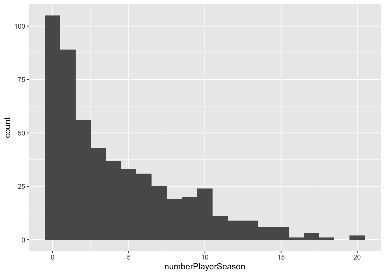
Nope. See how it falls into a small set of possible categories? This is an ordered categorical variable. That means we should calculate the proportions in each category
nba%>%
  group_by(numberPlayerSeason)%>%
  count(name="total_in_group")%>%
  ungroup()%>%
  mutate(proportion=total_in_group/sum(total_in_group))
## # A tibble: 20 × 3
## numberPlayerSeason total_in_group proportion
## <dbl> <int> <dbl>
## 1 0 105 0.198
## 2 1 89 0.168
## 3 2 56 0.106
## 4 3 43 0.0811
## 5 4 37 0.0698
## 6 5 33 0.0623
## 7 6 31 0.0585
## 8 7 25 0.0472
## 9 8 19 0.0358
## 10 9 20 0.0377
## 11 10 24 0.0453
## 12 11 11 0.0208
## 13 12 9 0.0170
## 14 13 9 0.0170
## 15 14 6 0.0113
## 16 15 6 0.0113
## 17 16 1 0.00189
## 18 17 3 0.00566
## 19 18 1 0.00189
## 20 20 2 0.00377What does this tell us?
Quick Exercise 3 Create a histogram for player age. What does that tell us about the NBA?
# INSERT CODE HERECategorical: ordered, binary
Let’s take a look at the variable for Rookie season.
nba%>%select(namePlayer,isRookie)## # A tibble: 530 × 2
## namePlayer isRookie
## <chr> <lgl>
## 1 LaMarcus Aldridge FALSE
## 2 Quincy Acy FALSE
## 3 Steven Adams FALSE
## 4 Alex Abrines FALSE
## 5 Bam Adebayo FALSE
## 6 Rawle Alkins TRUE
## 7 Grayson Allen TRUE
## 8 Deng Adel TRUE
## 9 Jaylen Adams TRUE
## 10 DeVaughn Akoon-Purcell TRUE
## # ℹ 520 more rowsOkay, so that’s set to a logical. In R, TRUE or FALSE are special values that indicate the result of a logical question. In this it’s whether or not the player is a rookie.
Usually we want a binary variable to have at least one version that’s structured so that 1= TRUE and 2=FALSE. This makes data analysis much easier. Let’s do that with this variable.
This code uses ifelse to create a new variable called isRookiebin that’s set to 1 if the isRookie variable is true, and 0 otherwise.
nba<-nba%>%
  mutate(isRookie_bin=ifelse(isRookie==TRUE,1,0))
Now that it’s coded 0,1 we can calculate the mean, which is the same thing as the proportion of the players that are rookies.
nba%>%summarize(mean=mean(isRookie_bin))## # A tibble: 1 × 1
## mean
## <dbl>
## 1 0.198Categorical: unordered
Let’s take a look at which college a player attended, which is a good example of an unordered categorical variable. The org variable tells us which organization the player was in before playing in the NBA.
nba%>%
  select(org)%>%
  glimpse()
## Rows: 530
## Columns: 1
## $ org <fct> Texas, NA, Other, FC Barcelona Basquet, Kentucky, NA, Duke, NA, NA…This look like team or college names, so this would be a categorical variable. Let’s take a look at the counts of players from different organizations:
nba%>%
  group_by(org)%>%
  count()%>%
  arrange(-n)%>%
  print(n=50)
## # A tibble: 68 × 2
## # Groups: org [68]
## org n
## <fct> <int>
## 1 <NA> 157
## 2 Other 85
## 3 Kentucky 25
## 4 Duke 17
## 5 California-Los Angeles 15
## 6 Kansas 11
## 7 Arizona 10
## 8 Texas 10
## 9 North Carolina 9
## 10 Michigan 8
## 11 Villanova 7
## 12 Indiana 6
## 13 Southern California 6
## 14 Syracuse 6
## 15 California 5
## 16 Louisville 5
## 17 Ohio State 5
## 18 Wake Forest 5
## 19 Colorado 4
## 20 Connecticut 4
## 21 Creighton 4
## 22 FC Barcelona Basquet 4
## 23 Florida 4
## 24 Georgia Tech 4
## 25 Michigan State 4
## 26 Oregon 4
## 27 Utah 4
## 28 Washington 4
## 29 Wisconsin 4
## 30 Boston College 3
## 31 Florida State 3
## 32 Georgetown 3
## 33 Gonzaga 3
## 34 Iowa State 3
## 35 Marquette 3
## 36 Maryland 3
## 37 Miami (FL) 3
## 38 North Carolina State 3
## 39 Notre Dame 3
## 40 Oklahoma 3
## 41 Purdue 3
## 42 Southern Methodist 3
## 43 Stanford 3
## 44 Tennessee 3
## 45 Virginia 3
## 46 Anadolu Efes S.K. 2
## 47 Baylor 2
## 48 Butler 2
## 49 Cincinnati 2
## 50 Kansas State 2
## # ℹ 18 more rowsHere we have a problem. If we’re interested just in colleges, we’re going to need to structure this a bit more. The code below filters out three categories that we don’t want: missing data, anything classified as others, and sports teams from other countries. The last is incomplete– I probably missed some! If I were doing this for real, I would use a list of colleges and only include those names.
What I do below is to negate the str_detect variable by placing the ! in front of it. This means I want all of the cases that don’t match the pattern the supplied. The pattern makes heavy use of the OR operator |. I’m saying I don’t want to include players whose organization included the letters CB r KK and so on (these are common prefixes for sports organizations in other countries, I definitely did not look that up on Wikipedia. Ok, I did.).
nba%>%
  filter(!is.na(org))%>%
  filter(!org=="Other")%>%
  filter(!str_detect(org,"CB|KK|rytas|FC|B.C.|S.K.|Madrid"))%>%
  group_by(org)%>%
  count()%>%
  arrange(-n)%>%
  print(n=50)
## # A tibble: 57 × 2
## # Groups: org [57]
## org n
## <fct> <int>
## 1 Kentucky 25
## 2 Duke 17
## 3 California-Los Angeles 15
## 4 Kansas 11
## 5 Arizona 10
## 6 Texas 10
## 7 North Carolina 9
## 8 Michigan 8
## 9 Villanova 7
## 10 Indiana 6
## 11 Southern California 6
## 12 Syracuse 6
## 13 California 5
## 14 Louisville 5
## 15 Ohio State 5
## 16 Wake Forest 5
## 17 Colorado 4
## 18 Connecticut 4
## 19 Creighton 4
## 20 Florida 4
## 21 Georgia Tech 4
## 22 Michigan State 4
## 23 Oregon 4
## 24 Utah 4
## 25 Washington 4
## 26 Wisconsin 4
## 27 Boston College 3
## 28 Florida State 3
## 29 Georgetown 3
## 30 Gonzaga 3
## 31 Iowa State 3
## 32 Marquette 3
## 33 Maryland 3
## 34 Miami (FL) 3
## 35 North Carolina State 3
## 36 Notre Dame 3
## 37 Oklahoma 3
## 38 Purdue 3
## 39 Southern Methodist 3
## 40 Stanford 3
## 41 Tennessee 3
## 42 Virginia 3
## 43 Baylor 2
## 44 Butler 2
## 45 Cincinnati 2
## 46 Kansas State 2
## 47 Louisiana State 2
## 48 Memphis 2
## 49 Missouri 2
## 50 Murray State 2
## # ℹ 7 more rowsThat looks better. Which are the most common colleges and universities that send players to the NBA?
Quick Exercise 4 Arrange the number of players by team in descending order.
# INSERT CODE HERECategorical: unordered, binary
There are two conference in the NBA, eastern and western. Let’s take a look at the variable that indicates which conference the payer played in that season.
nba%>%select(idConference)%>%
  glimpse()
## Rows: 530
## Columns: 1
## $ idConference <int> 2, 2, 2, 2, 1, 1, 2, 1, 1, 2, 2, 1, 2, 1, 1, 1, 1, 2, 2, …It looks like conference is structured as numeric, but a “1” or a “2”. Because it’s best to have binary variables structured as “has the characteristic” or “doesn’t have the characteristic” we’re going to create a variable for western conference that’s set to 1 if the player was playing in the western conference and 0 if the player was not (this is the same as playing in the eastern conference).
nba<-nba%>%
  mutate(west_conference=ifelse(idConference==1,1,0))
Once we’ve done that, we can see how many players played in each conference.
nba%>%
  summarize(mean(west_conference))
## # A tibble: 1 × 1
## `mean(west_conference)`
## <dbl>
## 1 0.508Makes sense!
Quick Exercise 5:* create a variable for whether or not the player is from the USA. Calculate the proportion of players from the USA in the NBA. The coding on country is … decidedy US-centric, so you’ll need to think about this one a bit.
# INSERT CODE HEREAnalysis
Ok, now that we know how this works, we can do some summary analysis. First of all, what does the total number of field goals made look like by college?
We know that field goals are continuous (sort of) so let’s summarize them via the mean. We know that college is a categorical variable, so we’ll use that to group the data. This is one of our first examples of a conditiona mean, which we’ll use a lot.
Top 50 Colleges by Total FG
nba%>%
  filter(!is.na(org))%>%
  filter(!org=="Other")%>%
  filter(!str_detect(org,"CB|KK|rytas|FC|B.C.|S.K.|Madrid"))%>%
  group_by(org)%>%
  summarize(mean_fg=sum(fgm))%>%
  arrange(-mean_fg)%>%
  print(n=50)
## # A tibble: 57 × 2
## org mean_fg
## <fct> <dbl>
## 1 Kentucky 6594
## 2 Duke 4623
## 3 Texas 3437
## 4 California-Los Angeles 3382
## 5 Kansas 2765
## 6 Arizona 2101
## 7 Oklahoma 1767
## 8 Southern California 1758
## 9 Louisville 1679
## 10 North Carolina 1659
## 11 Indiana 1522
## 12 Ohio State 1486
## 13 Michigan 1392
## 14 Wake Forest 1364
## 15 Connecticut 1299
## 16 Villanova 1222
## 17 Georgia Tech 1169
## 18 Tennessee 1095
## 19 Stanford 949
## 20 Utah 943
## 21 Marquette 873
## 22 Gonzaga 863
## 23 Michigan State 820
## 24 Colorado 818
## 25 Virginia 816
## 26 Maryland 811
## 27 Missouri 756
## 28 California 734
## 29 Florida State 733
## 30 Georgetown 717
## 31 Memphis 620
## 32 Florida 618
## 33 North Carolina State 598
## 34 Boston College 586
## 35 Louisiana State 583
## 36 Syracuse 567
## 37 Iowa State 523
## 38 Butler 459
## 39 Wisconsin 456
## 40 Creighton 432
## 41 Oregon 352
## 42 Texas A&M 322
## 43 Baylor 312
## 44 Providence 291
## 45 Purdue 275
## 46 Notre Dame 263
## 47 Ulkerspor 252
## 48 Southern Methodist 246
## 49 Oklahoma State 242
## 50 West Virginia 236
## # ℹ 7 more rowsNext, what about field goal percentage?
Top 50 Colleges by Average Field Goal Percent
nba%>%
  filter(!is.na(org))%>%
  filter(!org=="Other")%>%
  filter(!str_detect(org,"CB|KK|rytas|FC|B.C.|S.K.|Madrid"))%>%
  group_by(org)%>%
  summarize(mean_ftp=mean(pctFT))%>%
  arrange(-mean_ftp)%>%
  print(n=50)
## # A tibble: 57 × 2
## org mean_ftp
## <fct> <dbl>
## 1 Tennessee 0.842
## 2 Virginia 0.833
## 3 Oklahoma 0.823
## 4 North Carolina State 0.817
## 5 West Virginia 0.804
## 6 Ulkerspor 0.803
## 7 Missouri 0.802
## 8 Wake Forest 0.802
## 9 Florida State 0.801
## 10 Murray State 0.798
## 11 Iowa State 0.795
## 12 Notre Dame 0.792
## 13 Memphis 0.788
## 14 Florida 0.784
## 15 Michigan 0.783
## 16 Stanford 0.779
## 17 Georgetown 0.775
## 18 Marquette 0.774
## 19 Utah 0.770
## 20 Kansas State 0.767
## 21 Butler 0.762
## 22 Gonzaga 0.761
## 23 North Carolina 0.756
## 24 Villanova 0.755
## 25 Texas 0.752
## 26 Connecticut 0.748
## 27 Providence 0.747
## 28 Boston College 0.742
## 29 Michigan State 0.730
## 30 Kansas 0.729
## 31 Indiana 0.729
## 32 Duke 0.728
## 33 Baylor 0.726
## 34 Arizona 0.721
## 35 Pallacanestro Biella 0.718
## 36 Wisconsin 0.712
## 37 Kentucky 0.712
## 38 Georgia Tech 0.712
## 39 Louisiana State 0.709
## 40 Creighton 0.698
## 41 Maryland 0.695
## 42 Vanderbilt 0.688
## 43 Washington 0.680
## 44 Louisville 0.679
## 45 Ohio State 0.679
## 46 California 0.675
## 47 Southern Methodist 0.673
## 48 Oregon 0.662
## 49 Texas A&M 0.652
## 50 Southern California 0.648
## # ℹ 7 more rowsQuick Exercise 6 Calculate field goals made by player season.
# INSERT CODE HEREQuick Exercise 7 Calculate free throw percent made by player season.
# INSERT CODE HEREConditional relationships: The “gender” gap in electoral politics
Conditional variation involves examining how the values of two or more variables are related to one another. Earlier we made these comparisons by creating different tibbles and then comparing across tibbles, but we can also make comparisons without creating multiple tibbles.
So load in the Michigan 2020 Exit Poll Data.
library(tidyverse)
library(scales)
mi_ep <- read_rds("https://github.com/rweldzius/PSC4175/raw/main/static/data/MI2020_ExitPoll_small.rds")
MI_final_small <- mi_ep %>%
  filter(preschoice=="Donald Trump, the Republican" | preschoice=="Joe Biden, the Democrat") %>%
  mutate(BidenVoter=ifelse(preschoice=="Joe Biden, the Democrat",1,0),
         TrumpVoter=ifelse(BidenVoter==1,0,1),
         AGE10=ifelse(AGE10==99,NA,AGE10))
We learned that if we count using multiple variables that R will count within values. Can we use this to analyze how this varies by groups? Let’s see!
MI_final_small %>%
  filter(AGE10==1) %>%
  count(preschoice,SEX) %>%
  mutate(PctSupport = n/sum(n),
         PctSupport = round(PctSupport, digits=2))
## # A tibble: 4 × 4
## preschoice SEX n PctSupport
## <chr> <dbl> <int> <dbl>
## 1 Donald Trump, the Republican 1 7 0.22
## 2 Donald Trump, the Republican 2 1 0.03
## 3 Joe Biden, the Democrat 1 9 0.28
## 4 Joe Biden, the Democrat 2 15 0.47Here we have broken everything out by both preschoice and SEX but the PctSupport is not quite what we want because it is the fraction of responses (out of 1) that are in each row rather than the proportion of support for each candidate by sex.
To correct this and to perform the functions within a value we need to use the group_by function.
We can use the group_by command to organize our data a bit better. What group_by does is to run all subsequent code separately according to the defined group.
So instead of running a count or summarize separately for both Males and Females as we did above, we can group_by the variable SEX.chr (or FEMALE or SEX – it makes no difference as they are all equivalent) and then preform the subsequent commands. So here we are going to filter to select those who are 24 and below and then we are going to count the number of Biden and Trump supporters within each value of SEX.chr
MI_final_small %>%
  filter(AGE10==1) %>%
  group_by(SEX) %>%
  count(preschoice)
## # A tibble: 4 × 3
## # Groups: SEX [2]
## SEX preschoice n
## <dbl> <chr> <int>
## 1 1 Donald Trump, the Republican 7
## 2 1 Joe Biden, the Democrat 9
## 3 2 Donald Trump, the Republican 1
## 4 2 Joe Biden, the Democrat 15Note that any functions of the data are also now organized by that grouping, so if we were to manually compute the proportions using the mutation approach discussed above we would get:
MI_final_small %>%
  filter(AGE10==1) %>%
  group_by(SEX) %>%
  count(preschoice) %>%
  mutate(PctSupport = n/sum(n),
         PctSupport = round(PctSupport, digits=2))
## # A tibble: 4 × 4
## # Groups: SEX [2]
## SEX preschoice n PctSupport
## <dbl> <chr> <int> <dbl>
## 1 1 Donald Trump, the Republican 7 0.44
## 2 1 Joe Biden, the Democrat 9 0.56
## 3 2 Donald Trump, the Republican 1 0.06
## 4 2 Joe Biden, the Democrat 15 0.94So you can see that PctSupport sums to 2.0 because it sums to 1.0 within each value of the grouping variable SEX.
If we wanted the fraction of voters who are in each unique category - so that the percentage of all the categories sum to 1.0 – we would want to ungroup before doing the mutation that calculates the percentage. So here we are doing the functions after the group_by() separately for each value of the grouping variables (here SEX) and then we are going to then undo that and return to the entire dataset.
MI_final_small %>%
  filter(AGE10==1) %>%
  group_by(SEX) %>%
  count(preschoice) %>%
  ungroup() %>%
  mutate(PctSupport = n/sum(n),
         PctSupport = round(PctSupport, digits=2))
## # A tibble: 4 × 4
## SEX preschoice n PctSupport
## <dbl> <chr> <int> <dbl>
## 1 1 Donald Trump, the Republican 7 0.22
## 2 1 Joe Biden, the Democrat 9 0.28
## 3 2 Donald Trump, the Republican 1 0.03
## 4 2 Joe Biden, the Democrat 15 0.47If we are just interested in the proportion and we do not care about the number of respondents in each value (although here it seems relevant!) we could also group_by and then summarize as follows:
MI_final_small %>%
  filter(AGE10==1) %>%
  group_by(SEX) %>%
  summarize(PctBiden = mean(BidenVoter),
          PctTrump = mean(TrumpVoter)) %>%
  mutate(PctBiden = round(PctBiden, digits =2),
         PctTrump = round(PctTrump, digits =2))
## # A tibble: 2 × 3
## SEX PctBiden PctTrump
## <dbl> <dbl> <dbl>
## 1 1 0.56 0.44
## 2 2 0.94 0.06Because we have already filtered to focus only on Biden and Trump voters, we don’t actually need both since PctBiden = 1 - PctTrump and PctTrump = 1 - PctBiden.
Note that we can have multiple groups. So if we want to group by age and by sex we can do the following…
MI_final_small %>%
  group_by(SEX, AGE10) %>%
  summarize(PctBiden = mean(BidenVoter)) %>%
  mutate(PctBiden = round(PctBiden, digits =2))
## # A tibble: 22 × 3
## # Groups: SEX [2]
## SEX AGE10 PctBiden
## <dbl> <dbl> <dbl>
## 1 1 1 0.56
## 2 1 2 0.58
## 3 1 3 0.58
## 4 1 4 0.76
## 5 1 5 0.58
## 6 1 6 0.42
## 7 1 7 0.46
## 8 1 8 0.56
## 9 1 9 0.61
## 10 1 10 0.57
## # ℹ 12 more rowsWe can also save it for later analysis and then filter or select the results. For example:
SexAge <- MI_final_small %>%
  group_by(SEX, AGE10) %>%
  summarize(PctBiden = mean(BidenVoter)) %>%
  mutate(PctBiden = round(PctBiden, digits =2)) %>%
  drop_na()
So if we want to look at the Biden support by age among females (i.e., SEX==2) we can look at:
SexAge %>%
  filter(SEX == 2)
## # A tibble: 10 × 3
## # Groups: SEX [1]
## SEX AGE10 PctBiden
## <dbl> <dbl> <dbl>
## 1 2 1 0.94
## 2 2 2 0.93
## 3 2 3 0.69
## 4 2 4 0.71
## 5 2 5 0.52
## 6 2 6 0.6
## 7 2 7 0.63
## 8 2 8 0.74
## 9 2 9 0.69
## 10 2 10 0.61Quick Exercise 8 What is the Biden support by age among males?
# INSERT CODE HEREDicrete Variable By Discrete Variable (Barplot)
If we are working with discrete/categorical/ordinal/data — i.e., variables that take on a finite (and small) number of unique values then we are interested in how to compare across bar graphs.
Before we used geom_bar to plot the number of observations associated with each value of a variable. But we often want to know how the number of observations may vary according to a second variable. For example, we care not only about why voters reported that they supported Biden or Trump in 2020 but we are also interested in knowing whether Biden and Trump voters were voting for similar or different reasons. Did voters differ in terms of why they were voting for a candidate in addition to who they were voting for? If so, this may suggest something about what each set of voters were looking for in a candidate.
Let’s first plot the barplot and then plot the barplot by presidential vote choice for the Michigan Exit Poll we were just analyzing.
We are interested in the distribution of responses to the variable Quality and we only care about voters who voted for either Biden or Trump (preschoice) so let’s select those variables and filter using preschoice to select those respondents. We have an additional complication that the question was only asked of half of the respondents and some that were asked refused to answer. To remove these respondents we want to drop_na (note that this will drop every observation with a missing value – this is acceptable because we have used select to focus on the variables we are analyzing, but if we did not use select it would have dropped an observation with missing data in any variable. We could get around this using drop_na(Quality) if we wanted). A final complication is that some respondents did not answer the question they were asked so we have to use filter to remove respondents with missing observations.
Now we include labels – note how we are suppressing the x-label because the value labels are self-explanatory in this instance and add the geom_bar as before.
mi_ep %>%
    select(Quality,preschoice) %>%
    filter(preschoice == "Joe Biden, the Democrat" | preschoice == "Donald Trump, the Republican") %>%
    drop_na() %>%
    filter(Quality != "[DON'T READ] Don’t know/refused") %>%
    ggplot(aes(x= Quality)) +
    labs(y = "Number of Voters",
         x = "",
         title = "Michigan 2020 Exit Poll: Reasons for voting for a candidate") +
geom_bar(color="black") 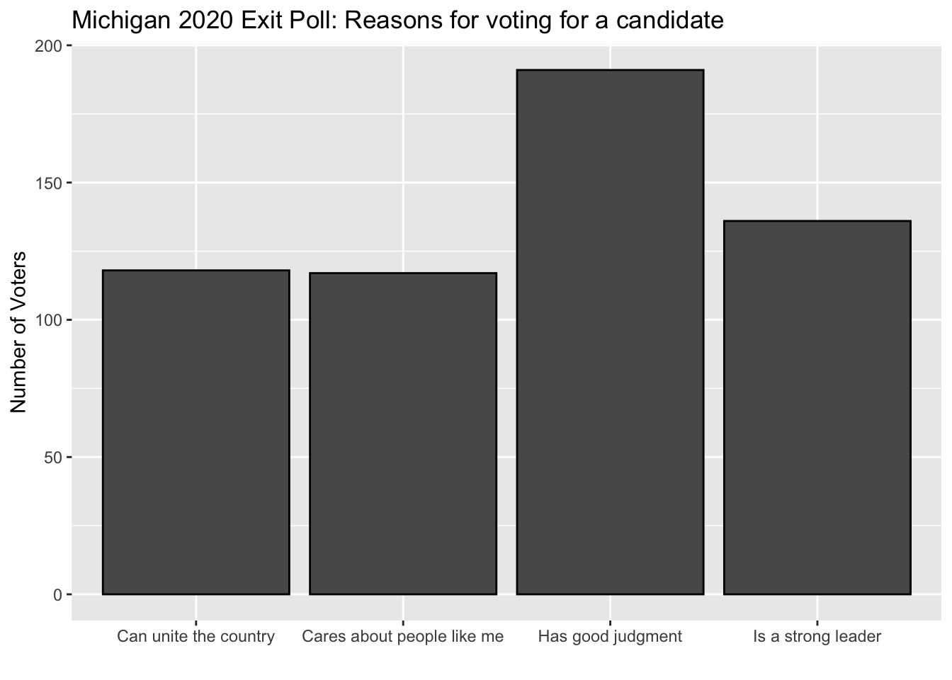
Note that if we add coord_flip that we will flip the axes of the graph. (We could also have done this by changing aes(y= Quality), but then we would also have to change the associated labels.)
mi_ep %>%
    select(Quality,preschoice) %>%
    filter(preschoice == "Joe Biden, the Democrat" | preschoice == "Donald Trump, the Republican") %>%
    drop_na() %>%
    filter(Quality != "[DON'T READ] Don’t know/refused") %>%
    ggplot(aes(x= Quality)) +
    labs(y = "Number of Voters",
         x = "",
         title = "Michigan 2020 Exit Poll: Reasons for voting for a candidate") +
    geom_bar(color="black") +
  coord_flip()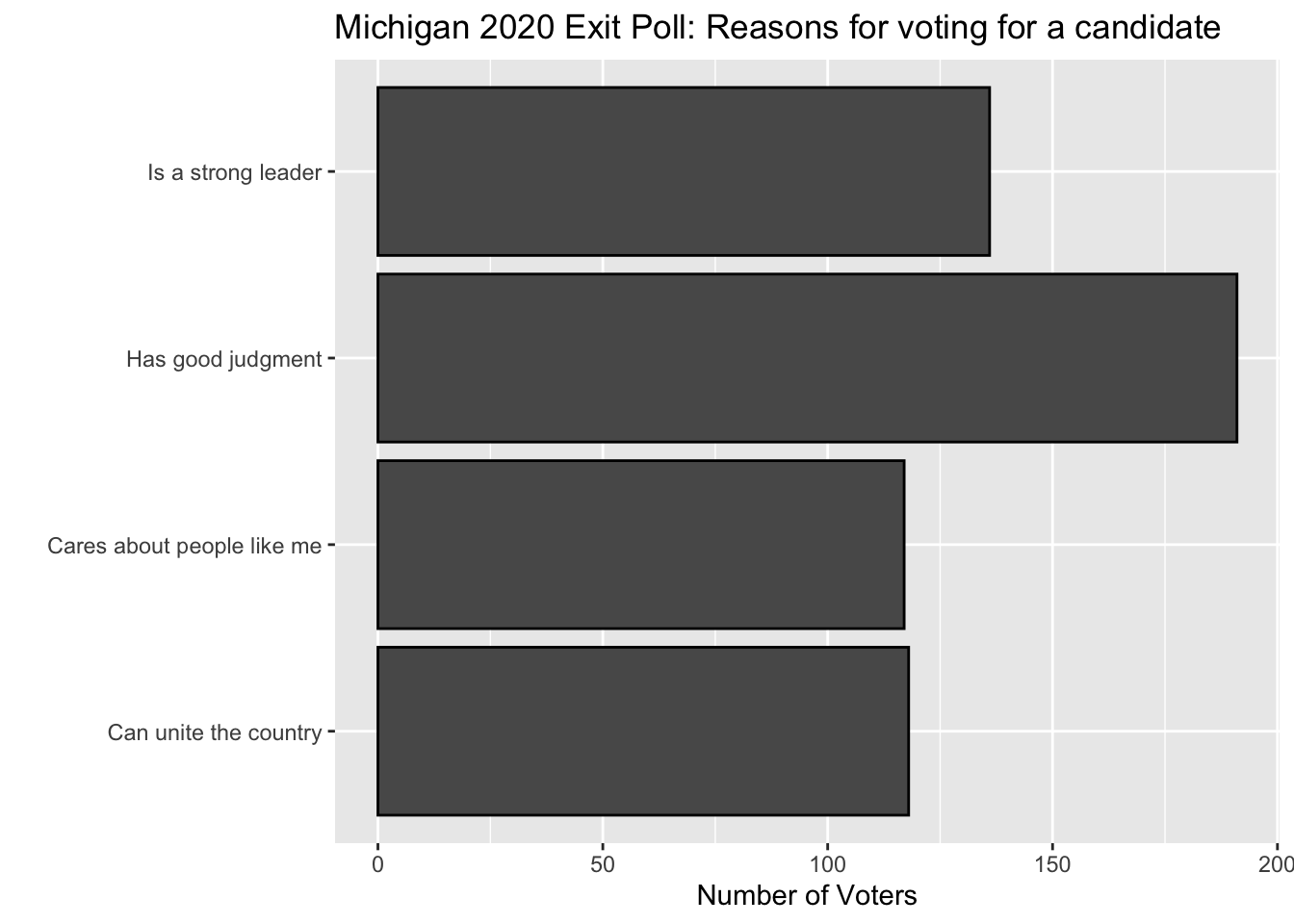
So enough review, lets add another dimension to the data. To show how the self-reported reasons for voting for a presidential candidate varied by vote choice we are going to use the fill of the graph to create different color bars depending on the value of the character or factor variable that is used to fill.
So we are going to include as a ggplot aesthetic a character or factor variable as a fill (here fill=preschoice) and then we are going to also include fill in the labs function to make sure that we label the meaning of the values being plotted. The other change we have made is in geom_bar where we used position=dodge to make sure that the bars are plotted next to one-another rather than on top of one another.
mi_ep %>%
    select(Quality,preschoice) %>%
    filter(preschoice == "Joe Biden, the Democrat" | preschoice == "Donald Trump, the Republican") %>%
    drop_na() %>%
    filter(Quality != "[DON'T READ] Don’t know/refused") %>%
    ggplot(aes(x= Quality, fill = preschoice)) +
    labs(y = "Number of Voters",
         x = "",
         title = "Michigan 2020 Exit Poll: Reasons for voting for a candidate",
         fill = "Self-Reported Vote") +
    geom_bar(color="black", position="dodge") +
    coord_flip()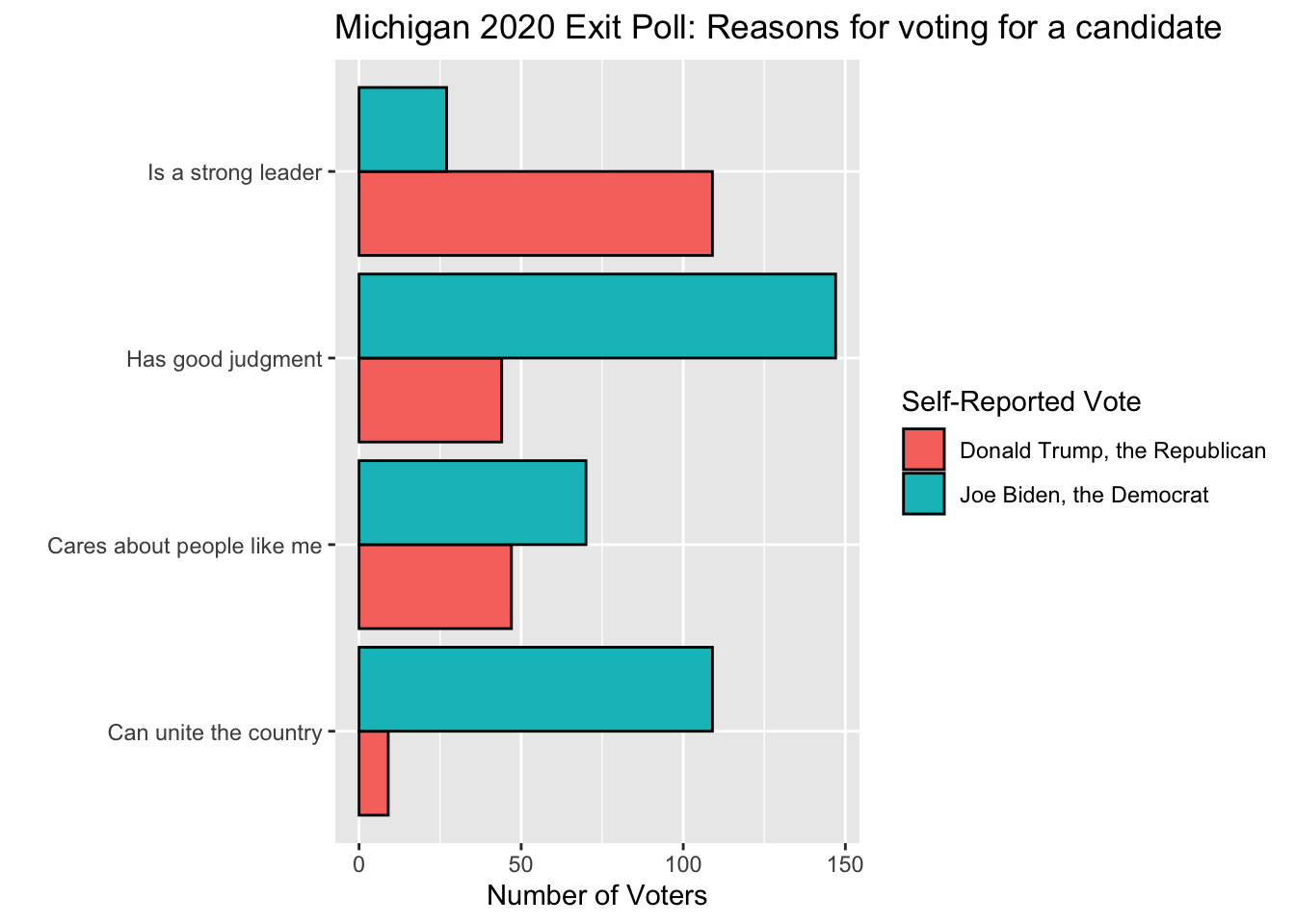
For fun, see what happens when you do not use postion=dodge. Also see what happens if you do not flip the coordinates using coord_flip.
It is important to note that the fill variable has to be a character or a factor. If we want to graph self-reported vote by sex, for example, we need to redefine the variable for the purposes of ggplot as follows. Note that because we are not mutating it and we are only defining it to be a factor within the `ggplot object, this redefinition will not stick. Note also the problem caused by uninformative values in SEX – can you change it.
mi_ep %>%
    filter(preschoice == "Joe Biden, the Democrat" | preschoice == "Donald Trump, the Republican") %>%
    ggplot(aes(x= preschoice, fill = factor(SEX))) +
    labs(y = "Number of Respondents",
         x = "",
         title = "Vote by Respondent Sex",
         fill = "Sex") +
    geom_bar(color="black", position="dodge") +
    coord_flip()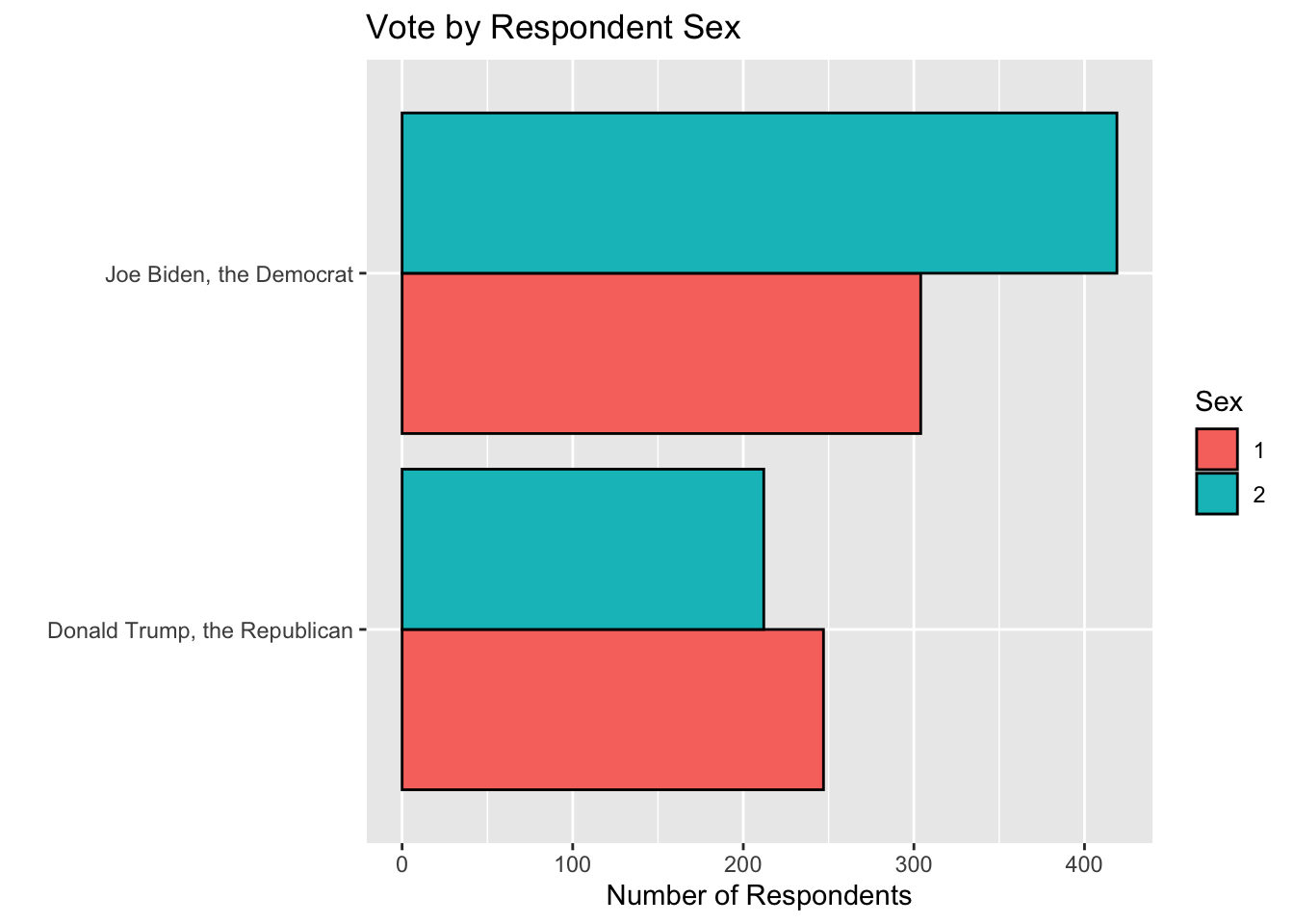
Quick Exercise 9 The barplot we just produced does not satisfy our principles of visualization because the fill being used is uninterpretable to those unfamiliar with the dataset. Redo the code to use a fill variable that produces an informative label. Hint: don’t overthink.
# INSERT CODE HEREA new question
Suppose we were concerned with whether some polls might give different answers because of variation in who the poll is able to reach using that method. People who take polls via landline phones (do you even know what that is?) might differ from those who take surveys online. Or people contacted using randomly generated phone numbers (RDD) may differ from those contacted from a voter registration list that has had telephone numbers merged onto it.
Polls were done using lots of different methods in 2020.
Loading the data
require(tidyverse)
Pres2020.PV <- read_rds(file="https://github.com/rweldzius/PSC4175/raw/main/static/data/Pres2020_PV.Rds")
Pres2020.PV <- Pres2020.PV %>%
                mutate(Trump = Trump/100,
                      Biden = Biden/100,
                      margin = Biden - Trump)
Pres2020.PV %>%
count(Mode)## # A tibble: 9 × 2
## Mode n
## <chr> <int>
## 1 IVR 1
## 2 IVR/Online 47
## 3 Live phone - RBS 13
## 4 Live phone - RDD 51
## 5 Online 366
## 6 Online/Text 1
## 7 Phone - unknown 1
## 8 Phone/Online 19
## 9 <NA> 29This raises the question of – how do we visualization variation in a variable by another variable? More specifically, how can we visualize how the margin we get using one type of survey compares to the margin from another type of poll? (We cannot use a scatterplot because the data is from different observations (here polls).)
We could do this using earlier methods by selecting polls with a specific interview method (“mode”) and then plotting the margin (or Trump or Biden), but that will produce a bunch of separate plots that may be hard to directly compare. (In addition to having more things to look at we would want to make sure that the scale of the x-axis and y-axis are similar.)
We can plot another “layer” of data in `ggplot using the fill paramter. Previously we used it to make the graphs look nice by choosing a particular color. But if we set fill to be a variable in our tibble then ggplot will plot the data seperately for each unique value in the named variable.
So if we want to plot the histogram of margin for two types of polls we can use the fill argument in ggplot to tell R to produce different fills depending on the value of that variable.
Pres2020.PV %>%
  filter(Mode == "IVR/Online" | Mode == "Live phone - RDD") %>%
    ggplot(aes(x= margin, fill = Mode)) +
  labs(y = "Number of Polls",
         x = "Biden- Trump Margin",
         title = "Biden-Trump Margin for Two Types of Polls",
        fill = "Mode of Interview") +
    geom_histogram(bins=10, color="black", position="dodge") +
    scale_x_continuous(breaks=seq(-.1,.2,by=.05),
                     labels= scales::percent_format(accuracy = 1))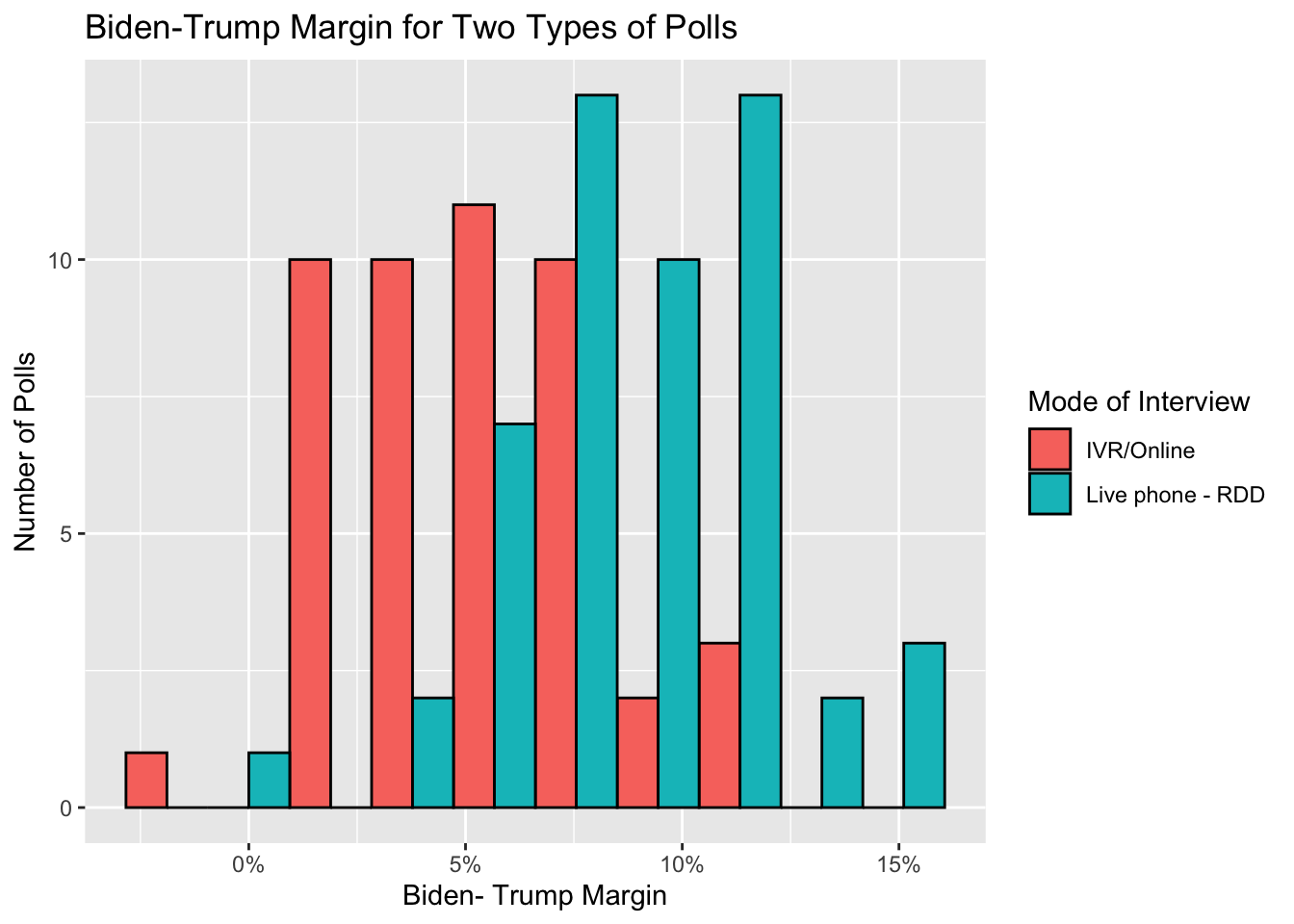
Quick Exercise 10 Try running the code without the filter. What do you observe? How useful is this? Why or why not?
# INSERT CODEWhile informative, it can be hard to compare the distribution of more than two categories using such methods. To compare the variation across more types of surveys we need to use a different visualization that summarizes the variation in the variable of interest a bit more. One common visualization is the boxplot which reports the mean, 25th percentile (i.e., the value of the data if we sort the data from lowest to highest and take the value of the observation that is 25% of the way through), the 75th percentile, the range of values, and notable outliers.
Let’s see what the boxplot of survey mode looks like after we first drop surveys that were conducted using modes that were hardly used (or missing).
Pres2020.PV %>%
  filter(Mode != "IVR" & Mode != "Online/Text" & Mode != "Phone - unknown" & Mode != "NA") %>%
  ggplot(aes(x = Mode, y = margin)) +
    labs(x = "Mode of Survey Interview",
         y = "Biden- Trump Margin",
         title = "2020 Popular Vote Margin by Type of Poll") +
    geom_boxplot(fill = "slateblue") +
    scale_y_continuous(breaks=seq(-.1,.2,by=.05),
                     labels= scales::percent_format(accuracy = 1))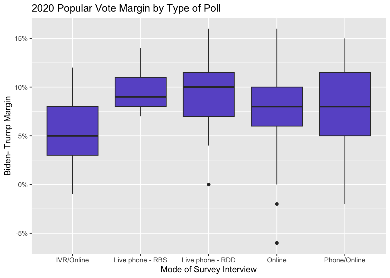
We can also flip the graph if we think it makes more sense to display it in a different orientation using coord_flip. (We could, of course, also redefine the x and y variables in the `ggplot object, but it is useful to have a command to do this to help you determine which orientiation is most useful).
Pres2020.PV %>%
  filter(Mode != "IVR" & Mode != "Online/Text" & Mode != "Phone - unknown" & Mode != "NA") %>%
  ggplot(aes(x = Mode, y = margin)) +
    labs(x = "Mode of Survey Interview",
         y = "Biden- Trump Margin",
         title = "2020 Popular Vote Margin by Type of Poll") +
    geom_boxplot(fill = "slateblue") +
    scale_y_continuous(breaks=seq(-.1,.2,by=.05),
                     labels= scales::percent_format(accuracy = 1)) +
    coord_flip()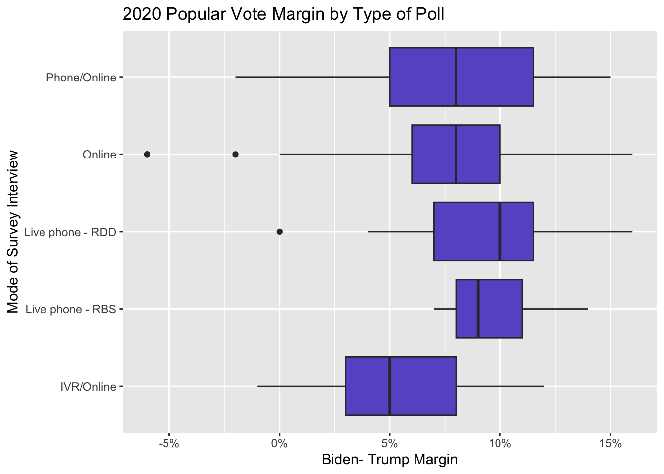
A downside of the boxplot is that it can be hard to tell how the data varies within each box. Is it equally spread out? How much data are contained in the lines (which are simply 1.5 times the height of the box)? To get a better handle on this we can use a “violin” plot that dispenses with a standard box and instead tries to plot the distribution of data within each category.
Pres2020.PV %>%
  filter(Mode != "IVR" & Mode != "Online/Text" & Mode != "Phone - unknown" & Mode != "NA") %>%
  ggplot(aes(x=Mode, y=margin)) +
    xlab("Mode") +
    ylab("Biden- Trump Margin") +
    geom_violin(fill="slateblue")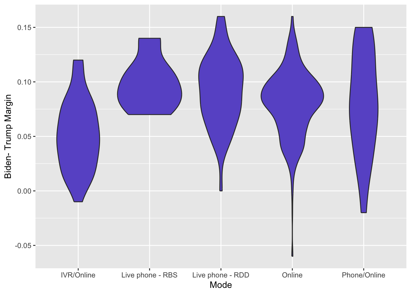
It is also hard to know how much data is being plotted. If some modes have 1000 polls and others have only 5 that seems relevant.
Quick Exercise 11 We have looked at the difference in margin. How about differences in the percent who report supporting Biden and Trump? What do you observe. Does this suggest that the different ways of contacting respondents may matter in terms of who responds? Is there something else that may explain the differences (i.e., what are we assuming when making this comparison)?
# INSERT CODE HEREQuick Exercise 12 Some claims have been made that polls that used multiple ways of contacting respondents were better than polls that used just one. Can you evaluate whether there were differences in so-called “mixed-mode” surveys compared to single-mode surveys? (This requires you to define a new variable based on Mode indicating whether survey is mixed-mode or not.)
# INSERT CODE HEREContinuous Variable By Continuous Variable (Scatterplot)
When we have two continuous variables we use a scatterplot to visualize the relationship. A scatterplot is simply a graph of every point in (x,y) where x is the value associated with the x-variable and y is the value associated with the y-variable. For example, we may want to see how support for Trump and Biden within a poll varies. So each observation is a poll of the national popular vote and we are going to plot the percentage of respondents in each poll supporting Biden against the percentage who support Trump.
To include two variables we are going to change our aesthetic to define both an x variable and a y variable – here aes(x = Biden, y = Trump) and we are going to label and scale the axes appropriately.
Pres2020.PV %>%
  ggplot(aes(x = Biden, y = Trump)) +
  labs(title="Biden and Trump Support in 2020 National Popular Vote",
       y = "Trump Support",
       x = "Biden Support") +
  geom_point(color="purple") +
    scale_y_continuous(breaks=seq(0,1,by=.05),
                     labels= scales::percent_format(accuracy = 1)) +
  scale_x_continuous(breaks=seq(0,1,by=.05),
                     labels= scales::percent_format(accuracy = 1))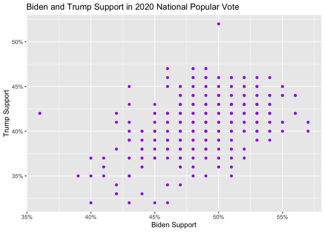
The results are intriguing! First the data seems like it falls along a grid. This is because of how poll results are reported in terms of percentage points and it highlights that even continuous variables may be reported in discrete values. This is consequential because it is hard to know how many polls are associated with each point on the graph. How many polls are at the point (Biden 50%, Trump 45%)? This matters for trying to determine what the relationship might be. Second, it is clear that there are some questions that need to be asked – why doesn’t Biden + Trump = 100\%?
To try to display how many observations are located at each point we have two tools at our disposal. First, we can alter the “alpha transparency” by setting alpha-.5 in the geom_point call. By setting a low level of transparency, this means that the point will become less transparent as more points occur at the same coordinate. Thus, a faint point indicates that only a single poll (observation) is located at a coordinate whereas a solid point indicates that there are many polls. When we apply this to the scatterplot you can immediately see that most of the polls are located in the neighborhood of Biden 50%, Trump 42%.
Pres2020.PV %>%
  ggplot(aes(x = Biden, y = Trump)) +
  labs(title="Biden and Trump Support in 2020 National Popular Vote",
       y = "Trump Support",
       x = "Biden Support") +
  geom_point(color="purple",alpha = .3) +
    scale_y_continuous(breaks=seq(0,1,by=.05),
                     labels= scales::percent_format(accuracy = 1)) +
  scale_x_continuous(breaks=seq(0,1,by=.05),
                     labels= scales::percent_format(accuracy = 1))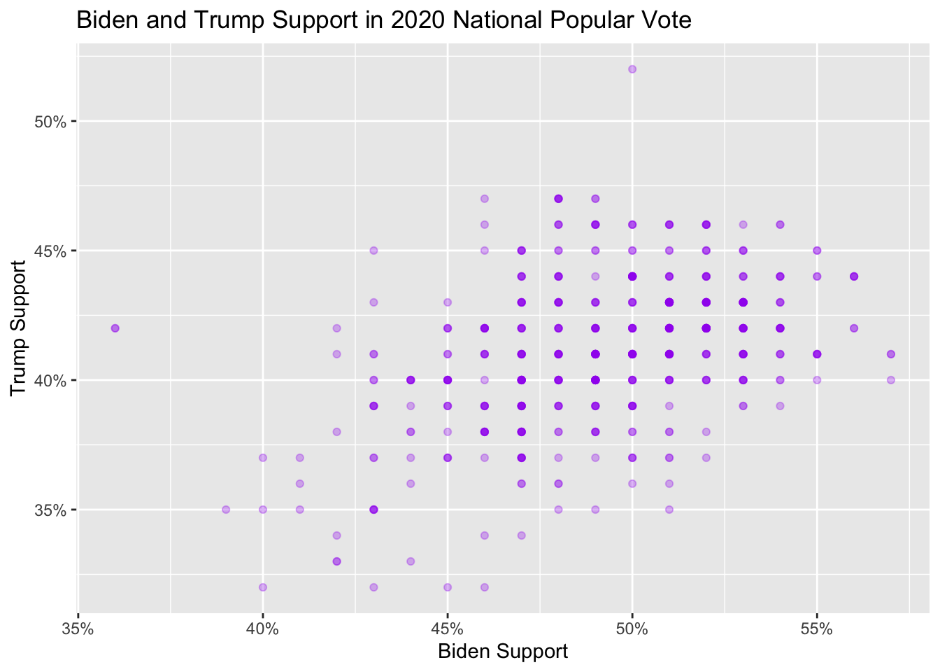
However, the grid-like nature of the plot is still somewhat hard to interpret as it can be hard to discern variations in color gradient. Another tool is to add a tiny bit of randomness to the x and y values associated with each plot. Instead of values being constrained to vary by a full percentage point, for example, the jitter allows it to vary by less. To do so we replace geom_point with geom_jitter.
Pres2020.PV %>%
  ggplot(aes(x = Biden, y = Trump)) +
  labs(title="Biden and Trump Support in 2020 National Popular Vote",
       y = "Trump Support",
       x = "Biden Support") +
  geom_jitter(color="purple",alpha = .5) +
    scale_y_continuous(breaks=seq(0,1,by=.05),
                     labels= scales::percent_format(accuracy = 1)) +
  scale_x_continuous(breaks=seq(0,1,by=.05),
labels= scales::percent_format(accuracy = 1)) 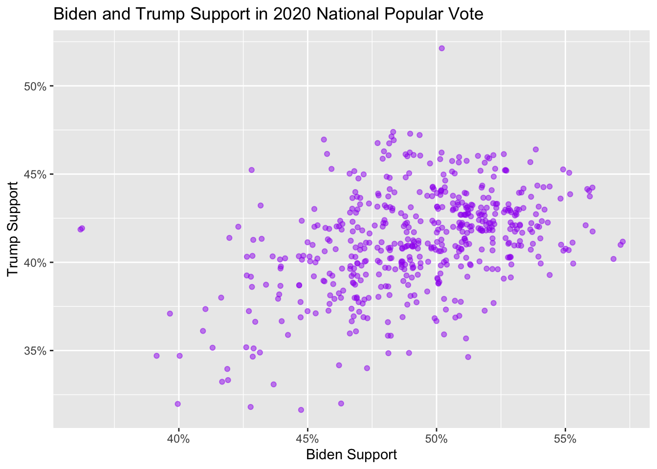
Note how much the visualization changes. Whereas before the eye was focused on – and arguably distracted by – the grid-like orientation imposed by the measurement, once we jitter the points we are immediately made aware of the relationship between the two variables. While we are indeed slightly changing our data by adding random noise, the payoff is that the visualization arguably better highlights the nature of the relationship. Insofar the goal of visualization is communication, this trade-off seems worthwhile in this instance. But here again is where data science is sometimes art as much as science. The decision of which visualization to use depends on what you think most effectively communicates the nature of the relationship to the reader.
We can also look at the accuracy of a poll as a function of the sample size. This is also a relationship between two continuous variables – hence a scatterplot! Are polls with more respondents more accurate? There is one poll with nearly 80,000 respondents that we will filter out to me able to show a reasonable scale. Note that we are going to use labels = scales::comma when plotting the x-axis to report numbers with commas for readability.
Pres2020.PV %>%
  filter(SampleSize < 50000) %>%
  mutate(TrumpError = Trump - RepCertVote/100,
         BidenError = Biden - DemCertVote/100) %>%
  ggplot(aes(x = SampleSize, y = TrumpError)) +
  labs(title="Trump Polling Error in 2020 National Popular Vote as a function of Sample Size",
       y = "Error: Trump Poll - Trump Certified Vote",
       x = "Sample Size in Poll") +
  geom_jitter(color="purple",alpha = .5) +
  scale_y_continuous(breaks=seq(-.2,1,by=.05),
                     labels= scales::percent_format(accuracy = 1)) +
  scale_x_continuous(breaks=seq(0,30000,by=5000),
labels= scales::comma) 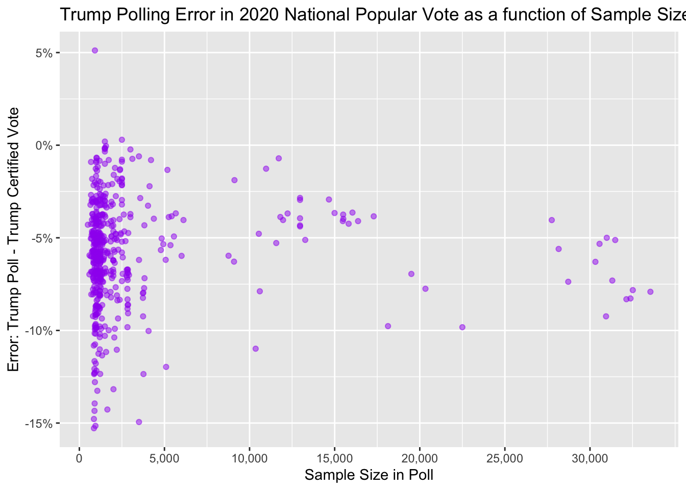
In sum, we have tested Trump’s theory that the MSM was biased against him. We found that polls that underpredicted Trump also underpredicted Biden. This is not what we would expect if the polls favored one candidate over another.
Pres2020.PV %>%
  ggplot(aes(x = Biden, y = Trump)) +
  labs(title="Biden and Trump Support in 2020 National Popular Vote",
       y = "Trump Support",
       x = "Biden Support") +
  geom_jitter(color="purple",alpha = .5) +
    scale_y_continuous(breaks=seq(0,1,by=.05),
                     labels= scales::percent_format(accuracy = 1)) +
  scale_x_continuous(breaks=seq(0,1,by=.05),
labels= scales::percent_format(accuracy = 1)) 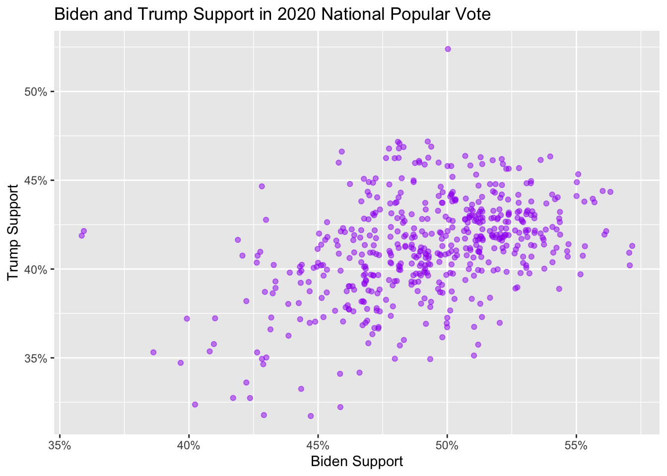
What is an alternative explanation for these patterns? Why would polls underpredict both Trump and Biden?
Perhaps they were fielded earlier in the year, when more people were interested in third party candidates, or hadn’t made up their mind. We’ll turn to testing this theory next time!