Confidence and Uncertainty
Homework 8
Motivation: How much do turnovers matter?
We’re going to work with a different dataset covering every NBA game played in the seasons 2016-17 to 2018-19. I’m interested in whether winning teams have higher or lower values of turnovers, and whether winning teams tend to more often make over 80 percent of their free throws.
library(tidyverse)The Data
The data for today is game by team summary data for every game played from 2017 to 2019. Make sure to download the data (game_summary.Rds) and save to your data folder!
gms<-read_rds("https://github.com/rweldzius/PSC4175/raw/main/static/data/game_summary.Rds")
gms
## # A tibble: 7,380 × 16
## idGame yearSeason dateGame idTeam nameTeam locationGame tov pts treb
## <dbl> <int> <date> <dbl> <chr> <chr> <dbl> <dbl> <dbl>
## 1 21600001 2017 2016-10-25 1.61e9 Clevela… H 14 117 51
## 2 21600001 2017 2016-10-25 1.61e9 New Yor… A 18 88 42
## 3 21600002 2017 2016-10-25 1.61e9 Portlan… H 12 113 34
## 4 21600002 2017 2016-10-25 1.61e9 Utah Ja… A 11 104 31
## 5 21600003 2017 2016-10-25 1.61e9 Golden … H 16 100 35
## 6 21600003 2017 2016-10-25 1.61e9 San Ant… A 13 129 55
## 7 21600004 2017 2016-10-26 1.61e9 Miami H… A 10 108 52
## 8 21600004 2017 2016-10-26 1.61e9 Orlando… H 11 96 45
## 9 21600005 2017 2016-10-26 1.61e9 Dallas … A 15 121 49
## 10 21600005 2017 2016-10-26 1.61e9 Indiana… H 16 130 52
## # ℹ 7,370 more rows
## # ℹ 7 more variables: oreb <dbl>, pctFG <dbl>, pctFT <dbl>, teamrest <dbl>,
## # second_game <lgl>, isWin <lgl>, ft_80 <dbl>The codebook for this dataset is as follows:
| Name | Description |
|---|---|
| idGame | Unique game id |
| yearSeason | Which season? NBA uses ending year so 2016-17 = 2017 |
| dateGame | Date of the game |
| idTeam | Unique team id |
| nameTeam | Team Name |
| locationGame | Game location, H=Home, A=Away |
| tov | Total turnovers |
| pts | Total points |
| treb | Total rebounds |
| pctFG | Field Goal Percentage |
| teamrest | How many days since last game for team |
| pctFT | Free throw percentage |
| isWin | Won? TRUE or FALSE |
| ft_80 | Team scored more than 80 percent of free throws |
We’re interested in knowing about how turnovers tov are different between game winners isWin.
Continuous Variables: Point Estimates
gms%>%
  filter(yearSeason==2017)%>%
  group_by(isWin)%>%
  summarize(mean(tov))
## # A tibble: 2 × 2
## isWin `mean(tov)`
## <lgl> <dbl>
## 1 FALSE 13.8
## 2 TRUE 12.9It looks like there’s a fairly substantial difference– winning teams turned the ball over an average of 12.9 times, while losing teams turned it over an average of 13.8 times. One way to summarize this is that winning teams in general had one less turnover per game than losing teams.
What if we take these results and decide that these will apply in other seasons? We could say something like: “Winning teams over the course of a season will turn the ball over 12.9 times, and losing teams 13.8 times, period.” Well let’s look and see:
gms%>%
  filter(yearSeason==2018)%>%
  group_by(isWin)%>%
  summarize(mean(tov))
## # A tibble: 2 × 2
## isWin `mean(tov)`
## <lgl> <dbl>
## 1 FALSE 14.1
## 2 TRUE 13.3gms%>%
filter(yearSeason==2019)%>%
group_by(isWin)%>%
summarize(mean(tov))## # A tibble: 2 × 2
## isWin `mean(tov)`
## <lgl> <dbl>
## 1 FALSE 13.9
## 2 TRUE 13.1So, no, that’s not right. In other seasons winning teams turned the ball over less, but it’s not as simple as just saying it will always be the two numbers we calculated from the 2017 data.
What we’d like to be able to do is make a more general statement, not just about a given season but about what we can expect in general. To do that we need to provide some kind of range of uncertainty: what range of turnovers can we expect to see from both winning and losing teams? To do that we’re going to use some key insights from probability theory and statistics that help us generate estimates of uncertainty.
Quick exercise 1 Are winning teams in 2017 more likely to make more than 80 percent of their free throws?*
gms%>%
filter(...)%>%
group_by(...elt())%>%
summarize(mean(...))## Error in group_by(., ...elt()): '...' used in an incorrect contextSampling
We’re going to start by building up a range of uncertainty from the data we already have. We’ll do this by sampling from the data itself.
Let’s just take very small sample of games– 100 games– and calculate turnovers for winners and losers. We are going to set.seed to ensure that we get the same/similar answers every time we run the “random number” generator.
set.seed(210916)
sample_size<-100
gms%>%
filter(yearSeason==2017)%>% ## Filter to just 2017
sample_n(size=sample_size, replace=TRUE) %>% ## Sample size is as set above. Replacement is set to TRUE
group_by(isWin)%>% ## Group by win/lose
summarize(mean(tov)) ## calculate mean## # A tibble: 2 × 2
## isWin `mean(tov)`
## <lgl> <dbl>
## 1 FALSE 14.7
## 2 TRUE 12.9And again:
gms%>%
filter(yearSeason==2017)%>% ## Filter to just 2017
sample_n(size=sample_size, replace=TRUE) %>% ## Sample size is as set above
group_by(isWin)%>% ## Group by win/lose
summarize(mean(tov)) ## calculate mean## # A tibble: 2 × 2
## isWin `mean(tov)`
## <lgl> <dbl>
## 1 FALSE 14.1
## 2 TRUE 13Sometimes we can get samples where the winning team turned the ball over more! These reasmples on their own don’t appear to be particularly useful, but what would happen if we calculated a bunch (technical term) of them?
I can continue this process of sampling and generating values many times using a loop. The code below resamples from the data 1,000 times, each time calculating the mean turnovers for winners and losers in a sample of size 10. It then adds those two means to a growing list, using the bind_rows function. ## Warning: the code below will take a little while to run
gms_tov_rs<-NULL ## Create a NULL variable: will fill this in later
for (i in 1:1000){ # Repeat the steps below 1000 times
gms_tov_rs<-gms%>% ## Create a dataset called gms_tov_rs (rs=resampled)
filter(yearSeason==2017)%>% ## Just 2017
sample_n(size=sample_size, replace=TRUE) %>% ## Sample 100 games
group_by(isWin)%>% ## Group by won or lost
summarize(mean_tov=mean(tov))%>% ## Calculate mean turnovers for winners and losers
bind_rows(gms_tov_rs) ## add this result to the existing dataset
}Now I have a dataset that is built up from a bunch of small resamples from the data, with average turnovers for winners and losers in each small sample. Let’s see what these look like.
gms_tov_rs## # A tibble: 2,000 × 2
## isWin mean_tov
## <lgl> <dbl>
## 1 FALSE 14.5
## 2 TRUE 13.7
## 3 FALSE 13.7
## 4 TRUE 12.8
## 5 FALSE 14.4
## 6 TRUE 12.3
## 7 FALSE 13.6
## 8 TRUE 13.2
## 9 FALSE 13.6
## 10 TRUE 11.4
## # ℹ 1,990 more rowsThis is a dataset that’s just a bunch of means. We can calculate the mean of all of these means and see what it looks like:
gms_tov_rs%>%
group_by(isWin)%>%
summarise(mean_of_means=mean(mean_tov))## # A tibble: 2 × 2
## isWin mean_of_means
## <lgl> <dbl>
## 1 FALSE 13.8
## 2 TRUE 12.9How does this “mean of means” compare with the actual?
gms%>%
filter(yearSeason==2017)%>%
group_by(isWin)%>%
summarize(mean(tov))## # A tibble: 2 × 2
## isWin `mean(tov)`
## <lgl> <dbl>
## 1 FALSE 13.8
## 2 TRUE 12.9Pretty similar! It’s what we would expect, really, but it’s super important. If we repeatedly sample from a dataset, our summary measures of a sufficiently large number of repeated samples will converge on the true value of the measure from the dataset.
Quick exercise 2 Repeat the above, but do it for Pct of Free Throws above .8.
gms_ft_80_rs<-NULL ## Create a NULL variable: will fill this in later
for (i in 1:1000){ # Repeat the steps below 10,000 times
gms_ft_80_rs<-gms%>% ## Create a dataset called gms_tov_rs (rs=resampled)
filter(...)%>% ## Just 2017
sample_n(...) %>% ## Sample 100 games
group_by(...)%>% ## Group by won or lost
summarize(...)%>% ## Calculate mean turnovers for winners and losers
bind_rows(...) ## add this result to the existing dataset
}## Error in gms %>% filter(...) %>% sample_n(...) %>% group_by(...) %>% summarize(...) %>% : '...' used in an incorrect contextDistribution of Resampled Means
That’s fine, but the other thing is that the distribution of those repeated samples will tell us about what we can expect to see in other, out of sample data that’s generated by the same process.
Let’s take a look at the distribution of turnovers for game winners:
gms_tov_rs%>%
filter(isWin)%>%
ggplot(aes(x=mean_tov,fill=isWin))+
geom_density(alpha=.3)+
geom_vline(xintercept =12.9)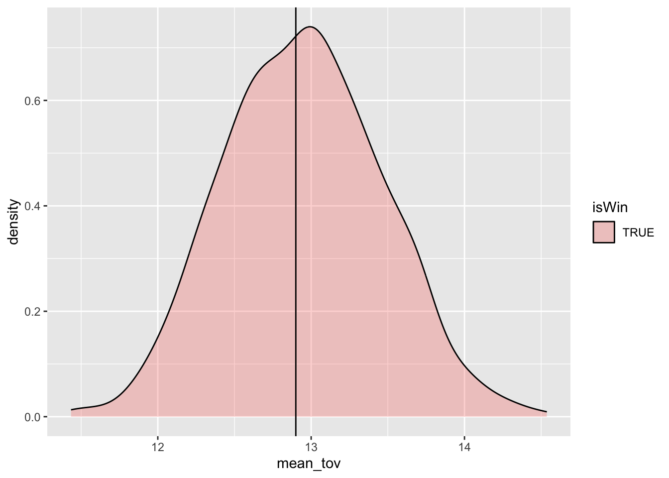
We can see that the mean of this distribution is centered right on the mean of the actual data, and it goes from about 11 to about 15. This is different than the minimum and maximum of the overall sample, which goes from 3 to 24 (bad night).
gms_tov_rs%>%
filter(isWin)%>%
summarize(value=fivenum(mean_tov))%>%
mutate(measure=c("Min","25th percentile","Median","75th percentile","Max"))%>%
select(measure, value)## # A tibble: 5 × 2
## measure value
## <chr> <dbl>
## 1 Min 11.4
## 2 25th percentile 12.6
## 3 Median 13.0
## 4 75th percentile 13.3
## 5 Max 14.5So what this tells us is that the minimum turnovers for winners in all of the samples we drew was 11.4, the maximum was about 14.5 and the median was 13.0.
And for game losers, let’s look at the distribution.
gms_tov_rs%>%
filter(!isWin)%>%
ggplot(aes(x=mean_tov,fill=isWin))+
geom_density(alpha=.3,fill="lightblue")+
geom_vline(xintercept =13.8)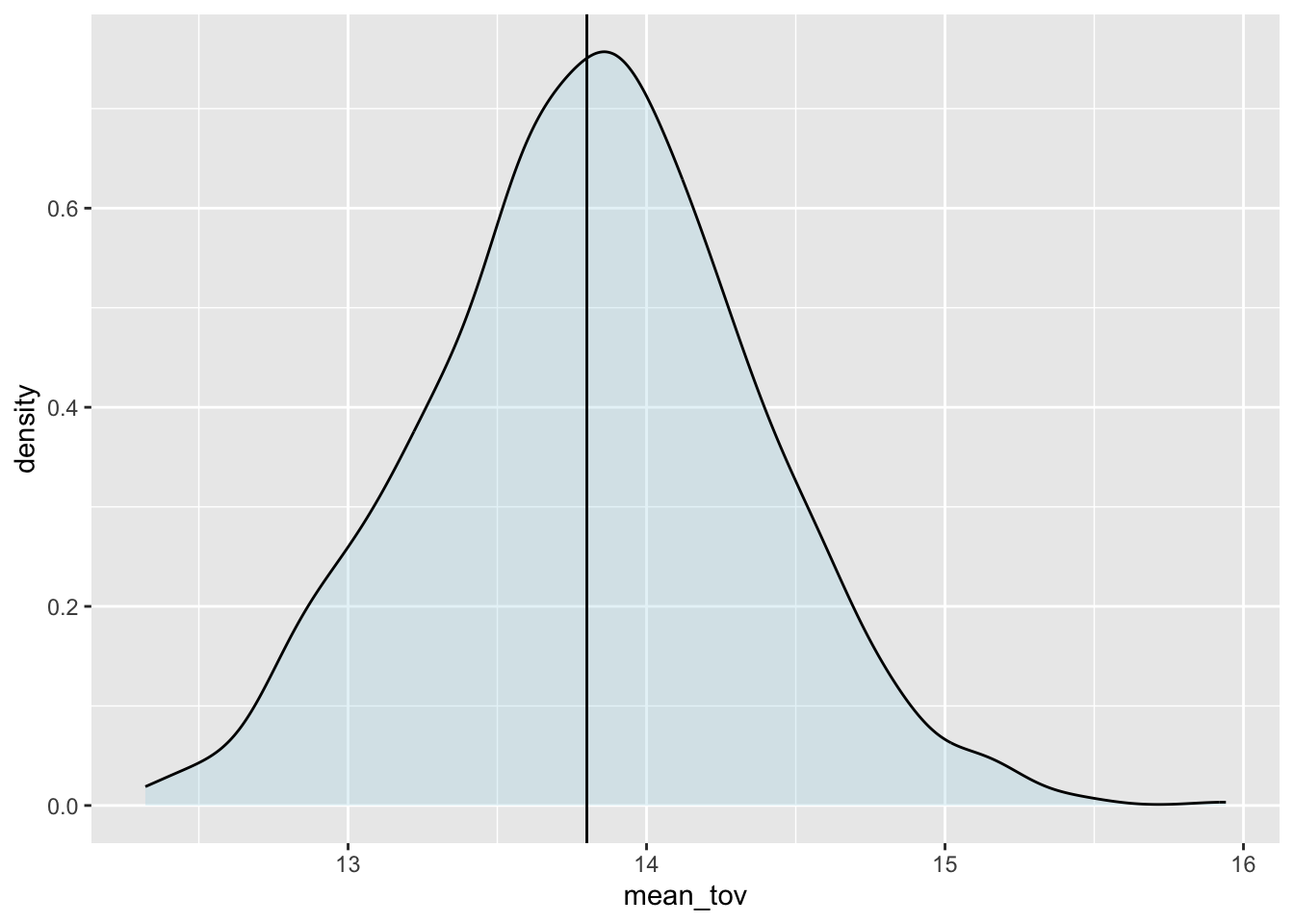
And now the particular values.
gms_tov_rs%>%
filter(!isWin)%>%
summarize(value=fivenum(mean_tov))%>%
mutate(measure=c("Min","25th percentile","Median","75th percentile","Max"))%>%
select(measure, value)## # A tibble: 5 × 2
## measure value
## <chr> <dbl>
## 1 Min 12.3
## 2 25th percentile 13.5
## 3 Median 13.8
## 4 75th percentile 14.2
## 5 Max 15.9For game losers, minimum turnovers for winners in all of the samples we drew was 12.3, the maximum was about 16 (!!) and the median was 13.8.
Quick exercise 3 Calculate the same summary, but do it for Pct of Free Throws above .8.
gms_ft_80_rs%>%
filter(isWin)%>% # for those who won
summarize(value=fivenum(mean_ft80))%>% ## Five number summary: described below
mutate(measure=c("Min","25th percentile","Median","75th percentile","Max"))%>%
select(measure, value)## Error in UseMethod("filter"): no applicable method for 'filter' applied to an object of class "NULL"gms_ft_80_rs%>% # now do the same for losers
filter(...)%>%
summarize(...)%>% ## Five number summary: described below
mutate(...)%>%
select(...)## Error in gms_ft_80_rs %>% filter(...) %>% summarize(...) %>% mutate(...) %>% : '...' used in an incorrect contextSo What? Using Percentiles of the Resampled Distribution
Now we can make some statements about uncertainty. Based on this what we can say is that in other seasons, we would expect that turnover for game winners will be in a certain range, and the same for game losers. What range? Well it depends on the level of risk you’re willing to take as an analyst. Academics (a cautious bunch to be sure) usually use the 5th percentile and the 95th percentile of the resampled values that were created.
So for game winners:
gms_tov_rs%>%
filter(isWin)%>%
summarize(pct_025=quantile(mean_tov,.025),
pct_975=quantile(mean_tov,.975))## # A tibble: 1 × 2
## pct_025 pct_975
## <dbl> <dbl>
## 1 12 14.0This tells us we can expect that game winners in future seasons will turn the ball over between about 12 and 14 times.
And how many times will their free throw percentage exceed 80%?
gms_ft_80_rs%>%
filter(isWin)%>%
summarize(pct_025=quantile(mean_ft80,.025),
pct_975=quantile(mean_ft80,.975))## Error in UseMethod("filter"): no applicable method for 'filter' applied to an object of class "NULL"And for game losers
gms_tov_rs%>%
filter(!isWin)%>%
summarize(pct_05=quantile(mean_tov,.025),
pct_95=quantile(mean_tov,.975))## # A tibble: 1 × 2
## pct_05 pct_95
## <dbl> <dbl>
## 1 12.8 14.9This tells us that we can expect that game losers in future seasons will turn the ball over between … 12.8 and 14.9 times.
Don’t be disappointed! It just turns out that if we want to make accurate statements about out of sample data, we need to reflect our uncertainty.
Let’s check to see if our expectations are borne out in future seasons:
gms%>%
filter(yearSeason==2018)%>%
group_by(isWin)%>%
summarize(mean(tov))## # A tibble: 2 × 2
## isWin `mean(tov)`
## <lgl> <dbl>
## 1 FALSE 14.1
## 2 TRUE 13.3gms%>%
filter(yearSeason==2019)%>%
group_by(isWin)%>%
summarize(mean(tov))## # A tibble: 2 × 2
## isWin `mean(tov)`
## <lgl> <dbl>
## 1 FALSE 13.9
## 2 TRUE 13.1So, our intervals for both winners and losers did include the values in future seasons.
Other intervals– the tradeoff between a “precise” interval and risk
You may be underwhelmed at this point, because the 95 percent range is a big range of possible turnover values. We can use narrower intervals– it just raises the risk of being wrong. Let’s try the middle 50 percent.
gms_tov_rs%>%
group_by(isWin)%>%
summarize(pct_25=quantile(mean_tov,.25),
pct_75=quantile(mean_tov,.75))## # A tibble: 2 × 3
## isWin pct_25 pct_75
## <lgl> <dbl> <dbl>
## 1 FALSE 13.5 14.2
## 2 TRUE 12.6 13.3Okay, now we’re saying that winners will have between 12.6 and 13.3 turnovers. Is that right?
gms%>%
filter(yearSeason==2018)%>%
group_by(isWin)%>%
summarize(mean(tov))## # A tibble: 2 × 2
## isWin `mean(tov)`
## <lgl> <dbl>
## 1 FALSE 14.1
## 2 TRUE 13.3gms%>%
filter(yearSeason==2019)%>%
group_by(isWin)%>%
summarize(mean(tov))## # A tibble: 2 × 2
## isWin `mean(tov)`
## <lgl> <dbl>
## 1 FALSE 13.9
## 2 TRUE 13.1Yes, this checks out for subsequent seasons. What about a really narrow interval– the middle 10 percent?
gms_tov_rs%>%
group_by(isWin)%>%
summarize(pct_45=quantile(mean_tov,.45),
pct_55=quantile(mean_tov,.55))## # A tibble: 2 × 3
## isWin pct_45 pct_55
## <lgl> <dbl> <dbl>
## 1 FALSE 13.8 13.9
## 2 TRUE 12.9 13.0gms%>%
filter(yearSeason==2018)%>%
group_by(isWin)%>%
summarize(mean(tov))## # A tibble: 2 × 2
## isWin `mean(tov)`
## <lgl> <dbl>
## 1 FALSE 14.1
## 2 TRUE 13.3In 2018, winning teams turned the ball over 13.3 times, on average. That’s below the range we gave! If we used a 10 percent interval we’d be wrong. Similarly, in 2018 losing teams turned the ball over 14.1 times, again below our interval.
gms%>%
  filter(yearSeason==2019)%>%
  group_by(isWin)%>%
  summarize(mean(tov))
## # A tibble: 2 × 2
## isWin `mean(tov)`
## <lgl> <dbl>
## 1 FALSE 13.9
## 2 TRUE 13.1In 2019, winning teams turned the ball over 13.1 times, on average. That’s below the range we gave! If we used a 10 percent interval we’d be wrong, again.
It turns out that the way this method works is that for an interval of a certain range, the calculated interval will include the true value of the measure in the same percent of repeated samples. We can think of each season as a repeated sample, so the middle 95 percent of this range will include the true value in 95 percent of seasons. When we call this a confidence interval, we’re saying we have confidence in the approach, not the particular values we calculated.
The tradeoff here is between providing a narrow range of values vs. the probability of being correct. We can give a very narrow interval for what we would expect to see in out of sample data, but we’re going to be wrong– a lot. We can give a very wide interval, but the information isn’t going to be useful to decisionmakers. This is one of the key tradeoffs in applied data analysis, and there’s no single answer to the question: what interval should I use? Academic work has settled on the 95 percent interval, but there’s no real theoretical justification for this.
Empirical Bootstrap
What we just did is called the empirical bootstrap. It’s massively useful, because it can be applied for any summary measure of the data: median, percentiles, and measures like regression coefficients. Here is the summary of steps for the empirical bootstrap:
- Decide on the summary measure to be used for the variable (it doesn’t have to be the mean)
- Calculate the summary measure on a small subsample (called the bootstrap sample) of the data
- Repeat step 2 many times (how many? Start with 1000, but more is better.) Compile the estimates.
- Calculate the percentiles of the bootstrap distribution from the previous step.
- Describe your uncertainty using those percentiles.
Quick exercise 4 Does 50 percent interval for free throws percent above 80 include the values for subsequent seasons?
gms_ft_80_rs%>%
  group_by(...)%>%
  summarize(pct_25=quantile(...),
           pct_75=quantile(...))
## Error in summarize(., pct_25 = quantile(...), pct_75 = quantile(...)): '...' used in an incorrect contextThe middle 50% of this distribution is between .36 and .46.
And in the actual subsequent seasons
gms%>%
  filter(yearSeason==2018)%>%
  summarize(mean(ft_80))
## # A tibble: 1 × 1
## `mean(ft_80)`
## <dbl>
## 1 0.389Yep, that checks out. And in 2019?
gms%>%
  filter(yearSeason==2019)%>%
  summarize(mean(ft_80))
## # A tibble: 1 × 1
## `mean(ft_80)`
## <dbl>
## 1 0.368Again, yes but just barely.
Summarizing the Bootstrap
The goal is to repeatedly calculate a measure of interest on random samples of the data. There are two basic ways to do this, both of which use a loop.
- Use a loop to generate 100 (or 1,000, or more) simulated datasets and then run the analysis on this massive object.
- Use a loop to generate a single simulated dataset and run the analysis within the loop, saving only the measures of interest.
To demonstrate, we’re going to go back to the other NBA data.
nba <- readRDS('https://github.com/rweldzius/PSC4175/raw/main/static/data/nba_players_2018.Rds')## Error in gzfile(file, "rb"): cannot open the connectionWe want to know if players from Tennessee are better at shooting free throws than players from Virginia. If we look at the overall data, we can see that NBA players who graduated from Tennessee are better overall.
nba %>%
  filter(org %in% c('Tennessee','Virginia')) %>%
  group_by(org) %>%
  summarise(pctFT = mean(pctFT))
## Error: object 'nba' not foundSo now let’s bootstrap this to express how confident we are in this conclusion.
Method 1: Big Dataset
set.seed(123)
bsSeasons <- NULL
for(bsSeason in 1:100) {
  tmpSeason <- nba %>%
    sample_n(size = nrow(.),replace = T) %>%
    select(org,pctFT) %>%
    mutate(bsSeasonNumber = bsSeason)
  bsSeasons <- bind_rows(bsSeasons,tmpSeason)
}
## Error: object 'nba' not foundnrow(bsSeasons)## NULLWe have a huge dataset of 100 simulated seasons which we can now run our analysis on. First, let’s compare free throw shooting in each simulated season.
bsSeasons %>%
  filter(grepl('Tennessee|^Virginia',org)) %>% # Focus only on the schools of interest
  group_by(bsSeasonNumber,org) %>% # Group by the simulated season and the organization
  summarise(mean_ftp = mean(pctFT),.groups = 'drop') # Calculate average pctFT
## Error in UseMethod("filter"): no applicable method for 'filter' applied to an object of class "NULL"In simulated seasons 1, 2, and 5 Tennessee grads are better shooters. However, in simulated seasons 3 and 4, Virginia grads have a better percentage!
But remember the question of interest – we want to calculate the difference in free throw percentage. To do this, we can use the spread() command to create one column for Tennessee and one column for Virginia
bsSeasons %>%
  filter(grepl('Tennessee|^Virginia',org)) %>%
  group_by(bsSeasonNumber,org) %>%
  summarise(mean_ftp = mean(pctFT),.groups = 'drop') %>%
  spread(org,mean_ftp) # Create two columns one for each school
## Error in UseMethod("filter"): no applicable method for 'filter' applied to an object of class "NULL"Interestingly, in seasons 7 and 8 we **don’t have measures of Virginia free throw shooting! This is because we just happened not to sample any players from Virginia in these simulated seasons! We can drop these missing values and then use mutate() to create the difference between Virginia and Tennessee.
bsSeasons %>%
  filter(grepl('Tennessee|^Virginia',org)) %>%
  group_by(bsSeasonNumber,org) %>%
  summarise(mean_ftp = mean(pctFT),.groups = 'drop') %>%
  spread(org,mean_ftp) %>%
  drop_na() %>% # Drop any rows with missing data in any column
  mutate(TNDiff = Tennessee - Virginia) # Calculate the difference in free throw shooting between TN and VA
## Error in UseMethod("filter"): no applicable method for 'filter' applied to an object of class "NULL"Values that are greater than zero indicate simulated seasons where Tennessee grads shot better, while values less than zero indicate simulated seasons where Virginia grads shot better. We can plot this as a distribution!
bsSeasons %>%
  filter(grepl('Tennessee|^Virginia',org)) %>%
  group_by(bsSeasonNumber,org) %>%
  summarise(mean_ftp = mean(pctFT),.groups = 'drop') %>%
  spread(org,mean_ftp) %>%
  drop_na() %>%
  mutate(TNDiff = Tennessee - Virginia) %>%
  ggplot(aes(x = TNDiff)) + # Plot the difference
  geom_density() +
  geom_vline(xintercept = 0,linetype = 'dashed') # Add a vertical line for clarity
## Error in UseMethod("filter"): no applicable method for 'filter' applied to an object of class "NULL"Our confidence is the proportion of times that Tennessee outshoots Virginia grads, or the proportion of the data that is to the right of zero (indicated with the vertical dashed line). We can calculate this proportion directly with a mean!
bsSeasons %>%
  filter(grepl('Tennessee|^Virginia',org)) %>%
  group_by(bsSeasonNumber,org) %>%
  summarise(mean_ftp = mean(pctFT),.groups = 'drop') %>%
  spread(org,mean_ftp) %>%
  drop_na() %>%
  mutate(TNDiff = Tennessee - Virginia) %>%
  mutate(TNBetter = ifelse(TNDiff > 0,1,0)) %>% # Create an indicator for whether TN did better
  summarise(mean(TNBetter))
## Error in UseMethod("filter"): no applicable method for 'filter' applied to an object of class "NULL"The benefit of creating the huge dataset first and then analyzing it is that we can look at many different aspects of the data. We can calculate the overall confidence, or we can plot the distribution of the difference. We can even plot the two distributions for each school!
bsSeasons %>%
  filter(grepl('Tennessee|^Virginia',org)) %>%
  group_by(bsSeasonNumber,org) %>%
  summarise(mean_ftp = mean(pctFT),.groups = 'drop') %>%
  ggplot(aes(x = mean_ftp,fill = org)) + # Plot the difference
  geom_density(alpha = .3)
## Error in UseMethod("filter"): no applicable method for 'filter' applied to an object of class "NULL"Method 2: Calculate within the loop
We could have instead calculated all this WITHIN each loop of the bootstrap.
set.seed(123)
bsRes <- NULL
for(counter in 1:100) {
  tmpEst <- nba %>%
    sample_n(size = nrow(.),replace = T) %>%
    filter(org %in% c('Tennessee','Virginia')) %>%
    group_by(org) %>%
    summarise(mean_FT = mean(pctFT,na.rm=T)) %>%
    ungroup() %>%
    spread(org,mean_FT) %>%
    mutate(bsSeason = counter)
  bsRes <- bind_rows(bsRes,tmpEst)
}
## Error: object 'nba' not foundThen we can plot and calculate without having to do the analysis.
bsRes %>%
  drop_na() %>%
  summarise(mean(Tennessee > Virginia)) # NOTE: You can calculate the average of TRUE/FALSE logic and R will know to treat it as a 1/0 number.
## Error in UseMethod("drop_na"): no applicable method for 'drop_na' applied to an object of class "NULL"bsRes %>%
drop_na() %>%
mutate(TNDiff = Tennessee - Virginia) %>%
ggplot(aes(x = TNDiff)) +
geom_density() +
geom_vline(xintercept = 0,linetype = 'dashed')## Error in UseMethod("drop_na"): no applicable method for 'drop_na' applied to an object of class "NULL"We can use the gather() command to get the overlapping plot as well.
bsRes %>%
  drop_na() %>%
  gather(org,mean_ft,-bsSeason) %>%
  ggplot(aes(x = mean_ft,fill = org)) +
  geom_density(alpha = .3)
## Error in UseMethod("drop_na"): no applicable method for 'drop_na' applied to an object of class "NULL"Quick exercise 5 Which team has the highest free throw percentage? How confident are you?
# INSERT CODE HEREYour Turn! Bootstrapping with your data
“Quick” exercise 6: Use your own dataset to bootstrap a 95% CI for the mean of one variable. Plot the bootstrap distribution and mark the sample mean. Write 2–3 sentences interpreting the interval.
# Require libraries; load data# Wrangle data (if needed); perhaps you want a binary variable to plot (i.e., a variable that equals 1 or 0.)# Bootstrap time! Don't forget to use set.seed(). Pro-tip: copy/paste from above and change the names of the dataframe and variable of interest. # Plot your bootstrap distribution. Don't forget to mark the sample mean!